their work and words, interviews, blogs, images, hints, tips, websites
and more...
Friday, October 26, 2012
My Usual Colors...sort of...
This is what I was using last year for my usual palette in my old repurposed Prang box. I'm moving away from the Cadmiums now, and I don't use Transparent Yellow as much as I did...the sap green is gone, too, but everything else is pretty much standard, when I'm NOT using the limited primaries palette!
My color-challenge continues...
 |
| Down in the Ozarks this past week, I knew I'd have a REAL challenge, with all the fall colors. This one was done on the spot... |
 |
| Still, it was fun to try to capture the effect of fire in this small sketch that was on one corner of a journal page... |
 |
| I kept it simple with this one...and liked the effect. |
I also found myself reaching for my original little Altoids kit with the primaries instead of the newer kit...but basically it's the same primaries, a warm yellow, Quin Red, and Phthalo Blue, plus B.S. and P.G. It's light and handy and slips into my purse.
I'm enjoying the challenge, but don't consider myself tied...it's a choice, not a geas!
Thursday, October 25, 2012
The Self Imposed Ink and Exercise Challenge
I'm trying out yet another Stillman and Birn Journal.... this time the Epsilon Series that has paper suited for pen and ink.
This is my first entry and I've got to say writing on this paper with a Micron pen is dreamy. The greys were created with grey and black Pentel Sign Pens that I hit the tip of with a waterbrush, then added the ink to the page. The water/ink combo spread like butter.
One thing I really like about using a waterbrush is that it dispenses just enough water to get the job done. This is very useful when the paper being used is not necessarily meant for washes.
This journal has two purposes. The first being to get me off of my desk chair and moving about. That's a challenge in itself as I get lost in my work and time goes sailing by. The second, and most fun, is to explore ink.
I'm glad the journal has many pages as there are so many inks waiting to be tried :) Which leads me to the back of my journal where I create color test pages......
I'm keeping this journal in my desk drawer, easily at hand. I've been sitting too long again... time to catch lunch and take a stroll with my journal and pens :)
This is my first entry and I've got to say writing on this paper with a Micron pen is dreamy. The greys were created with grey and black Pentel Sign Pens that I hit the tip of with a waterbrush, then added the ink to the page. The water/ink combo spread like butter.
One thing I really like about using a waterbrush is that it dispenses just enough water to get the job done. This is very useful when the paper being used is not necessarily meant for washes.
This journal has two purposes. The first being to get me off of my desk chair and moving about. That's a challenge in itself as I get lost in my work and time goes sailing by. The second, and most fun, is to explore ink.
I'm glad the journal has many pages as there are so many inks waiting to be tried :) Which leads me to the back of my journal where I create color test pages......
 |
| click to enlarge |
Labels:
ink,
Micron pen,
Pam Johnson Brickell,
Pentel Sign Pen,
Stillman and Birn sketchbooks,
waterbrushes
Friday, October 19, 2012
The color challenge continues--join me?
I'm continuing to play with a very limited palette...join me? I'm using Hansa Yellow Light, though a Cadmium would so for the yellow, Permanent Rose (or Quinacridone Rose or Quin Red) and Phthalo Blue (or similar would do). I've added Burnt Sienna and Payne's Grey for convenience colors....Indigo would work, too.
And look at all the colors possible. I've used the Burnt Sienna and Payne's Grey in the mixes, for variety. Above, yellows, reds, blues and convenience colors, reds ditto, and blues ditto! (Click on the image for a larger version.)
Even more colors are possible, if you add a bit of one of the other primary colors so you're using a triad in various strengths, as you can see below. Even a deep neutral that's very close to black. It all depends on how intense your mixtures are...
Of course the effects can be quite subtle, too...I only used the primaries in my painting of my little cat, Rags, asleep on my computer.
So give it a try, and post what you've done on our Artist's Journal Workshop Flickr group, here: http://www.flickr.com/groups/artists-journal-workshop/! Mark what you've done as primaries only, or primaries and convenience colors...and let's play!
Wednesday, October 17, 2012
Trying new things, challenging ourselves
.jpg) |
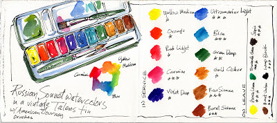
| A new brand, for me--well relatively, anyway. |
Liz wrote recently about trying new materials and approaches; Alissa is pushing herself to discover more about travel sketching. Laura travels to some amazing places to sketch, and has also challenged herself by painting a single subject (trees, faces) or using one color as dominant for a month, in the past--I think we learned almost as much as she did.
Right now, I'm exploring watercolor. Again. Still. Different brands, like the Russian Sonnet watercolors above...I found them on eBay and put some of the little pans into an old metal Talens paint box. (They're a less expensive version of Yarka St. Petersburg/White Nights watercolors, but so far they've passed all my tests with flying colors. Literally! )
I've used Winsor & Newton for decades, and over the years I've also tried Daniel Smith, Schmincke, Maimeri Blu, Kremer and others...but people kept raving about the Russian paints, doing such gorgeous work (like Pat Southern-Pearce!) that I just had to explore with them.
I'm doing a long-range fade test on them, which I'll report on later, but so far--yep, these are gorgeous, lift well, and mix beautifully, and I can't detect any fading over the months they've been exposed.
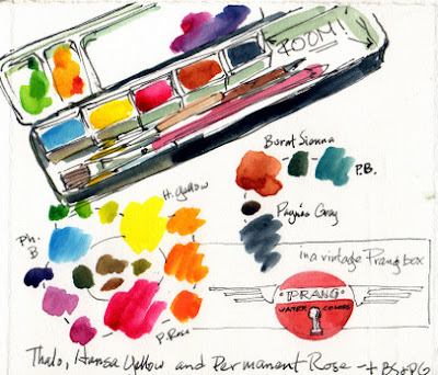 |
| Going simpler...with room for brushes, drawing sticks and lots of mixing area. |
And in my ongoing attempt to simplify my life and lighten my load, I've set up one of my vintage Prang boxes with the primaries with two convenience colors--Burnt Sienna and Payne's Gray. (On the left, here, you can see color tests with the Sonnet paints, and on the right my "new" old primary box.
Funny, when I first started painting with watercolors, Prang used to make a box that was just the primaries and black. I LOVED it. That's all I'd use, for years...I feel like I've come full circle!
I found out when I made my first little home made Altoids box a few years ago that I didn't need a billion colors--I just stumbled onto this combination, and recently I've been reading many resources that explain why they work! If you choose Phthalo Blue or similar, cool, clean Quinacridone Red or Rose (or Permanent Rose) as your red, and a good clear yellow, you can mix about anything--as you can see above. I started out my painting career with a warm red and a cool one, a warm blue and a cool one...but if I add a touch of rose to my Phthalo, I get something very like Ultramarine Blue. A little yellow in that nice clean rose gives me a good orange. Nifty!
Sure it takes a moment more to mix (hence my two convenience colors!)...but I'm balancing weight and simplicy against convenience and liking how it's coming out!
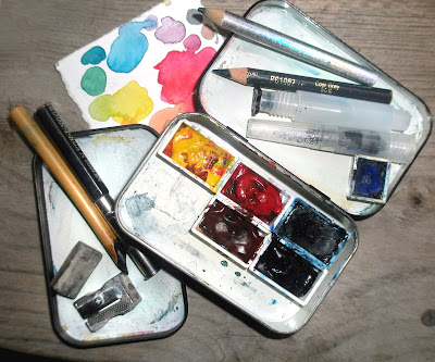 |
| You can tell how light THIS kit would be. I took the lid off a second box to double my mixing area--it friction-fits on the bottom of the box. |
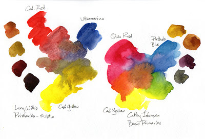 | |
| Here are some of my explorations...and how I got where I am now. |
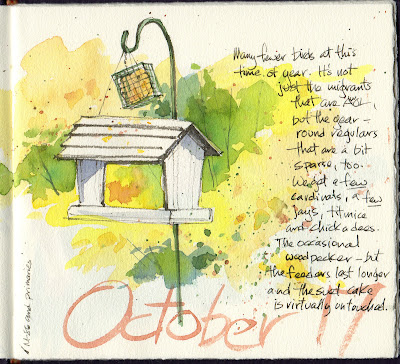 |
| Here's today's play...sorry the scan's a bit gray, the art definitely isn't! |
Tuesday, October 16, 2012
Sketchbook vs Journal
A quick update... I am still markering and using a moleskine cahier... Have just started my second one.
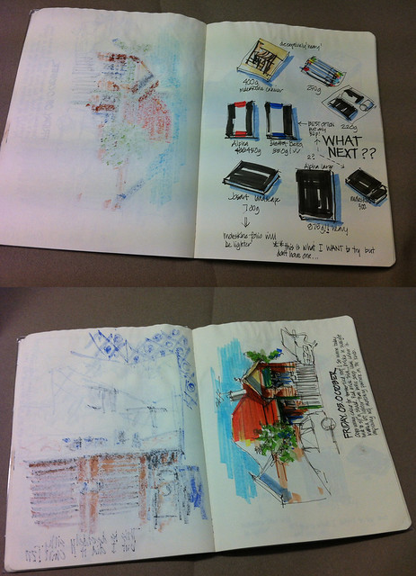
Today I just had a light bulb moment (like all light bulb moment they seem very obvious afterwards...)
As much as I loved working through the first moleskine- drawing only on one side of the page – I never fully bonded with the book. (getting severe water damage didn’t help much either!)
It is because I wasn’t working across the spread that it feels more like a sketchbook (each page a separate image that don’t connect) rather than a journal (a record of my life) Even though I did do a few journal type pages the flow between the pages wasn’t there. What is interesting is that a single page of this sketchbook at A4 size is the same size as what I am used to with my normal A5 sketchbook working across the spread. It is not the size but this ‘book-like quality’ to turning pages that obviously is so important to me.
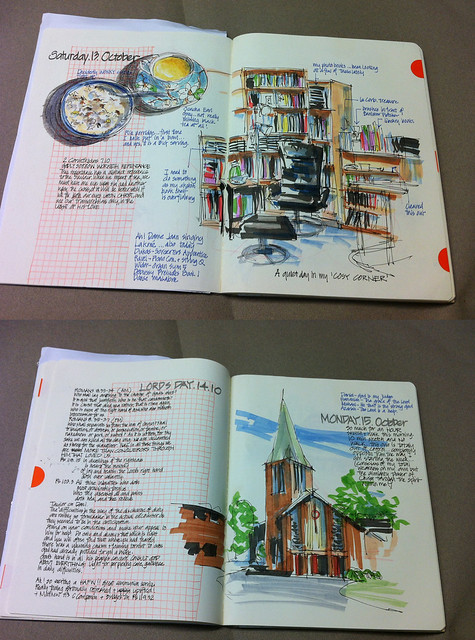
The second moleskine cahier, that I using now, I am going to work every second spread (little I did with the smaller sketchbook in my last post) and I am immediately excited by the feel. Excited that I am now back to journal style but even more excited but the possibilities of working larger size. So even when I write a heap of text like I regularly do, I can still tie it together with an image on the next page. Also combining various images on a page (even over a few days...yet to do this) makes it feel more like a travel journal (ah! That is always a nice feeling isn’t it?) And just in case you are wondering, I am ALWAYS thinking about my next trip (whenever and wherever it might be and thinking about what I will do next time- very much like Alissa’s project recently)
This concept follows on from a discussion recently on facebook when someone asked why we don’t sketch on single pages... I replied
it is very important for me to work in a sketchbook since my sketching is all about the process of recording a moment and telling the story of my life. Individual sheets of paper is too disjointed for me- sure I could bind them later but I like seeing the narrative evolve through a book. I find that there is a lot more pressure to produce a perfect 'image' when all I really want to do is have fun and record the moment.
but since then I have realised that just being in a sketchbook isn’t enough – there has to be a narrative!
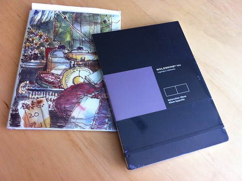
So, I think that by next adventure will be to try a large moleskine watercolour book (A4 landscape) I got one in the mail today. ... a little worried about whether it will fit on small cafe tables but excited by new adventures to come.
(the other sketchbook is the one I am currently using- my moleskine cahier with a cover by Paul Wang from Singapore) Ok... That's even rambling from me for today!!!

Today I just had a light bulb moment (like all light bulb moment they seem very obvious afterwards...)
As much as I loved working through the first moleskine- drawing only on one side of the page – I never fully bonded with the book. (getting severe water damage didn’t help much either!)
It is because I wasn’t working across the spread that it feels more like a sketchbook (each page a separate image that don’t connect) rather than a journal (a record of my life) Even though I did do a few journal type pages the flow between the pages wasn’t there. What is interesting is that a single page of this sketchbook at A4 size is the same size as what I am used to with my normal A5 sketchbook working across the spread. It is not the size but this ‘book-like quality’ to turning pages that obviously is so important to me.

The second moleskine cahier, that I using now, I am going to work every second spread (little I did with the smaller sketchbook in my last post) and I am immediately excited by the feel. Excited that I am now back to journal style but even more excited but the possibilities of working larger size. So even when I write a heap of text like I regularly do, I can still tie it together with an image on the next page. Also combining various images on a page (even over a few days...yet to do this) makes it feel more like a travel journal (ah! That is always a nice feeling isn’t it?) And just in case you are wondering, I am ALWAYS thinking about my next trip (whenever and wherever it might be and thinking about what I will do next time- very much like Alissa’s project recently)
This concept follows on from a discussion recently on facebook when someone asked why we don’t sketch on single pages... I replied
it is very important for me to work in a sketchbook since my sketching is all about the process of recording a moment and telling the story of my life. Individual sheets of paper is too disjointed for me- sure I could bind them later but I like seeing the narrative evolve through a book. I find that there is a lot more pressure to produce a perfect 'image' when all I really want to do is have fun and record the moment.
but since then I have realised that just being in a sketchbook isn’t enough – there has to be a narrative!

So, I think that by next adventure will be to try a large moleskine watercolour book (A4 landscape) I got one in the mail today. ... a little worried about whether it will fit on small cafe tables but excited by new adventures to come.
(the other sketchbook is the one I am currently using- my moleskine cahier with a cover by Paul Wang from Singapore) Ok... That's even rambling from me for today!!!
Sunday, October 14, 2012
Ups and Downs
 |
| The gift of a soft, rainy day, and the gift of a new journal...life IS good. |
 |
| But not without its challenges... |
One of the most important things about my journal is that it's a place to record the days--which was part of what the root word meant--the daily-ness of it. We remember more fully, we deal with adversity, we celebrate, we find a sense of humor when we need it. We play. We express gratitude. We explore.
I can't imagine doing without this...
Thursday, October 11, 2012
Taking advantage of unexpected opportunities
And what fun that is! It's starting to get cold at night and we'd had several hard frosts. Our outside "water feature" is just a big plastic planter filled with water and a fountain...and one lone goldfish, the last survivor of the 15 or so we put in in the first place. (We named him Norman Bates...)
After one particularly nippy night, I noticed Norman was sort of floating diagonally near the bottom of the pool, and whereas I know fish hibernate over the winter and have a kind of natural antifreeze, I wasn't sure our planter wouldn't freeze solid. He's hardy, but not THAT hardy.
So be bought an aquarium and a pump and moved him indoors...
The unexpected by-product was that I can SEE him now --much bigger than I thought--and he's fun to draw. Lots of quick ink and watercolor sketches the first day...
More careful studies with pencil and watercolor on the second...he's fascinating! (My cats think so too...but we have the lid taped down, so he's safe.)
This required reorganizing the whole living room, moving things around to accommodate a sturdy flat surface for the aquarium, but you know what? It was worth it! A whole new world to sketch...
 |
| It's great for a summer home, but going to be pretty chilly, SOON. |
Travel sketchbook thoughts : Alissa Duke
Thoughts on creating myTravel Sketchbook
I realised that I wanted to create my own sketchbooks in my drawing style when I travel.. They would be a narrative, day to day, capturing my travels, whether local, interstate or overseas.. As the sketchbooks would be created as I travel, I won’t have the luxury of all of the above editing factors. But I do have the luxury of being able to have an approach in my mind, a concept of how to approach a page composition and what works for me. That is the stage I am at now.
Sketchbook travel Journals
I currently draw my pre trip preparation – drawing my packed bag, or things in preparation – my sketch-kit, passport, currency. I also always draw at the airport, and on the airplane.( a good way to pass the time) So I am comfortable with the first few pages of my travel sketchbook.
o
o o My current creative investigation is into I
I am entering the 2013 Sketchbook Project and have chosen the theme : Travelogue.Paris 2007. I am revisiting my 2007 holiday to Paris, as if I was there, drawing as much then as I do now ! ..My sketchbook is based on my diaries, photographs I took and where I thought I would have drawn at the time, as well as souvenirs I bought. Although this is created in retrospect, all the time I thought how would approach future travel sketchbooks. I still have a few pages to complete, as it is not due to be sent away until January 2013.
My Travel Sketchbook :my thoughts
Over the 18 double pages of the Sketchbook Project I have experimented with composition, lettering, maps., It is different paper and size of my usual sketchbook and I have had to squeeze five days into a limited amount of pages. have come to the following conclusions
- it will be a combination of on the quick on the spot sketching and more detailed drawings
- leave first page or two of each day blank – at end of day I could draw maps, streets walked that day, rail/metro routes caught.
- draw objects such as tickets, souvenirs, food, headings also at the end of the day in my hotel room. There is time and space to draw. If there is a good view from the room, I can draw it everyday
- MAPS. If I colour the roads or areas between the road on a map I can match them with other colours I have used on the page, bringing it all together. Below are examples of maps and date experiments
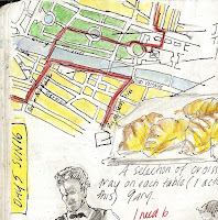
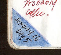
- leave lots of white space – I can always fill it in later if it looks too sparse.
- write commentary about how I feel, think, react to things, smells, places but not too much. I will probably keep a separate diary. I have read a very good book by Dave Fox called “Globejotting : how to write extraordinary travel journals”. I am not a writer, but it had some great hints.
- Re: buildings and vistas
- just try an draw a section
- leave the top, bottom or sides unfinished.- lines drifting off
- only colour some parts
- don’t try and fill the page - only use part of the page
- it is like a little vignette., with a little character and insight, but not too much
- don’t try and get caught up in the detail and try and leave this to a " close up " drawing later if I get the chance
Reading over what I have written it seems a little pedantic in places but it has been a very valuable creative experiment.
Thursday, October 4, 2012
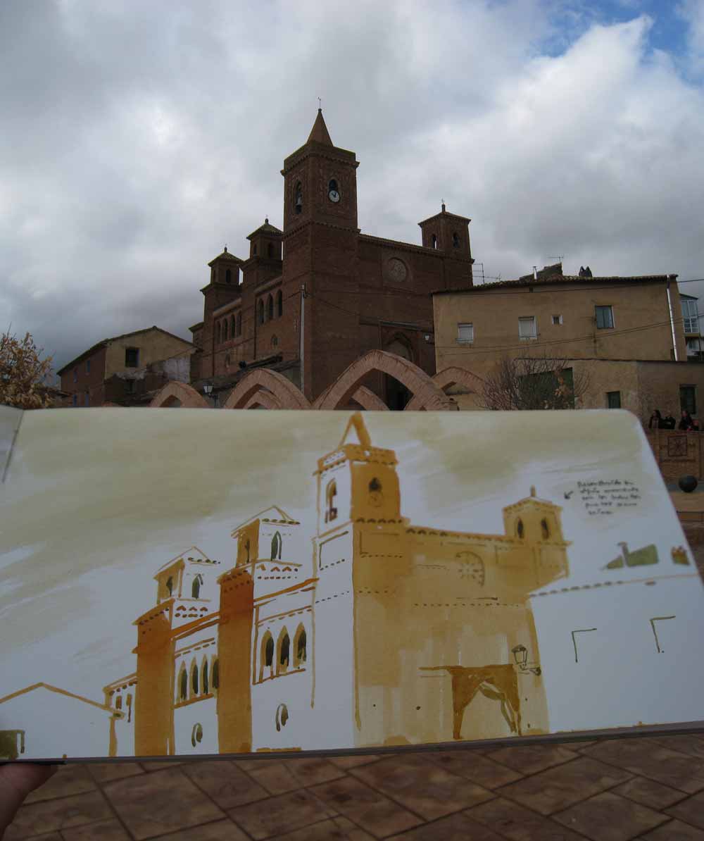
mudéjar
Drawing "mudéjar" a Spanish architectonic stlye from the XV Century. More photos here http://www.4ojos.com/blog/?p=8739
Tuesday, October 2, 2012
You never know what will happen next!
What I love about keeping a regular sketchbook just for yourself is that at times it seems to take you places you never really expect.
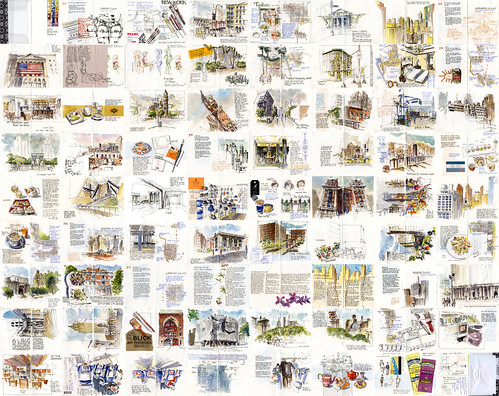
After my overseas trip in July I was all inspired and keen to do some different things. I attended the 3rd International Urban Sketchers Symposium in Santo Domingo (always an amazing source of inspiration) and then afterwards spent a week in New York sketching and socializing madly. This single image shows all the sketches I did that week. There is no doubt that I was somewhat out of control with my sketching.
I got home and had the desire to try something different and experiment… so I choose a sketchbook (Canson Universal) which did not have watercolour paper in the hope that this would loosen me up to try new things. The paper turned out better than expected and although the paper buckled, it made a lovely crinkly sound. I also started a 'sketch and walk' in the morning for 30 minutes before work. I walk for 20 minute and then sketch for 10…and find that I get into the office pumping!
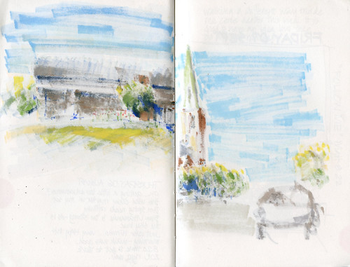
And then, one day I thought I would try to use markers (alcholol based markers than graphic designers use/used and I did a workshop at the symposium by Eduardo Bajzek who has been doing amazing things with them)
For a while now, I have thought that markers would be the perfect medium for me to use at work (I am an architect) as they are quick, can be used on bond paper, are dry and scan well. But I just never got the hang of them during office time...so I needed to test them out on the streets for myself.
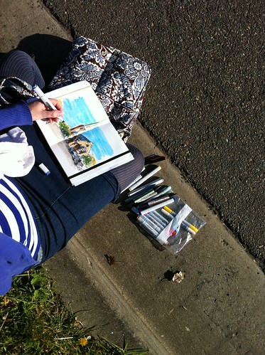
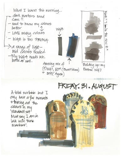
Well… after one or two days I got hooked and have been using them for the last 5 weeks…even to the point that last week I took my watercolour kit out of my everyday bag (purse) …shock horror- I would never think that would happen!..but I really hadn't touch them in 2 weeks.
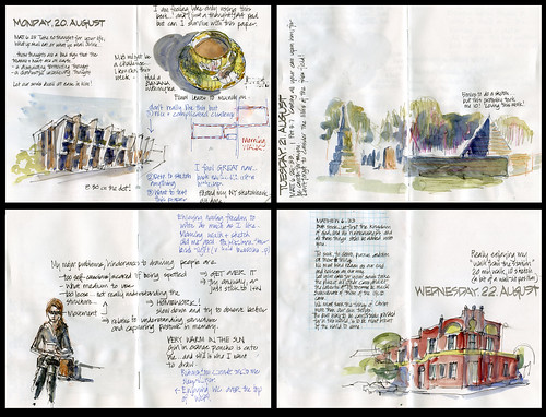
I am mainly using Copic markers and they have the really big disadvantage of bleeding through practically every paper…
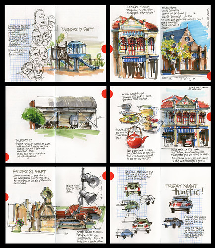
so I ended up only using every second spread and then use red dots to close the bleed through spread together….which was a nice graphic…though I was going through the sketchbook really fast (here is one weeks sketches)
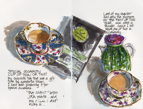
Trying them out on my signature tea cup sketch… they have limitations with mixing…but so much fun!
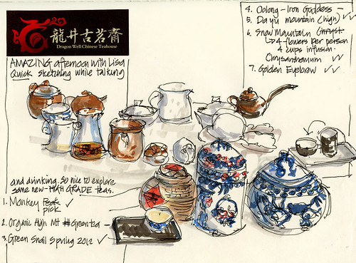
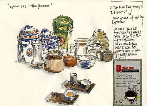
And then, on the weekend I was out with Alissa Duke at a very special Chinese tea house and after doing a quick sketch with markers suddenly felt that I just need to record this with my paint… so I did a second sketch. This was a sign to me that the markers are fine for my morning sketch and walk…but deep down watercolour is still the BEST for me!
I am now using a moleskine cahier… but getting ready to go back to a sketchbook with paper that is watercolour friendly!
But who knows where I will end up next …. I like going with the flow in my sketchbooks….
BTW more of my markering here

After my overseas trip in July I was all inspired and keen to do some different things. I attended the 3rd International Urban Sketchers Symposium in Santo Domingo (always an amazing source of inspiration) and then afterwards spent a week in New York sketching and socializing madly. This single image shows all the sketches I did that week. There is no doubt that I was somewhat out of control with my sketching.

I got home and had the desire to try something different and experiment… so I choose a sketchbook (Canson Universal) which did not have watercolour paper in the hope that this would loosen me up to try new things. The paper turned out better than expected and although the paper buckled, it made a lovely crinkly sound. I also started a 'sketch and walk' in the morning for 30 minutes before work. I walk for 20 minute and then sketch for 10…and find that I get into the office pumping!

And then, one day I thought I would try to use markers (alcholol based markers than graphic designers use/used and I did a workshop at the symposium by Eduardo Bajzek who has been doing amazing things with them)
For a while now, I have thought that markers would be the perfect medium for me to use at work (I am an architect) as they are quick, can be used on bond paper, are dry and scan well. But I just never got the hang of them during office time...so I needed to test them out on the streets for myself.

Well… after one or two days I got hooked and have been using them for the last 5 weeks…even to the point that last week I took my watercolour kit out of my everyday bag (purse) …shock horror- I would never think that would happen!..but I really hadn't touch them in 2 weeks.

I am mainly using Copic markers and they have the really big disadvantage of bleeding through practically every paper…

so I ended up only using every second spread and then use red dots to close the bleed through spread together….which was a nice graphic…though I was going through the sketchbook really fast (here is one weeks sketches)

Trying them out on my signature tea cup sketch… they have limitations with mixing…but so much fun!


And then, on the weekend I was out with Alissa Duke at a very special Chinese tea house and after doing a quick sketch with markers suddenly felt that I just need to record this with my paint… so I did a second sketch. This was a sign to me that the markers are fine for my morning sketch and walk…but deep down watercolour is still the BEST for me!
I am now using a moleskine cahier… but getting ready to go back to a sketchbook with paper that is watercolour friendly!
But who knows where I will end up next …. I like going with the flow in my sketchbooks….
BTW more of my markering here
Subscribe to:
Posts (Atom)


.JPG)


