I had an appointment with a doctor Tuesday to discuss the results of x-rays and MRI on my hip and back --- only to find out that the MRI department had imaged my hip but not my back, even though both were ordered. So a pointless appointment and once more being stuffed like a sausage in the tube . . .
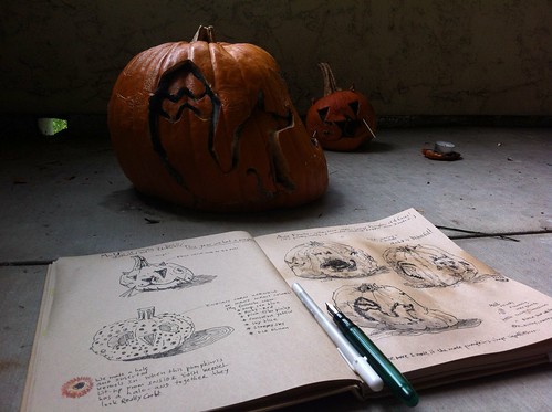
I was determined not to sketch more waiting rooms, but drew this decoration as I waited out of sheer frustration. His goofy grin helped me calm down and even laugh about the mistake. Good use of an art journal.
Pages
▼
Wednesday, November 28, 2012
Tuesday, November 27, 2012
Playing with the new Strathmore toned paper journal
I have a journal I use almost exclusively for writing, and decided I needed to try the new Strathmore hardbound journal when I ran out of my faves.
It's nice! Smooth surface, a pleasure to write in, tempting mid-tan color, and fun to do some art in, taking advantage of that middleground tone.
I'd definitely recommend these...I'm having a ball trying out different mediums in addition to my daily journaling!
It's nice! Smooth surface, a pleasure to write in, tempting mid-tan color, and fun to do some art in, taking advantage of that middleground tone.
 |
| This is a Prismacolor dark grey pencil with touches of white... |
 |
| Whee, more colored pencil and ink! |
 |
| Pilot Penmanship pen with water-soluble ink, plus white Prismacolor and gouache. |
 |
| And a female bluebird in gouache. The paper really buckles VERY little, and it's just plain fun! |
 |
| It was just a very quick pencil sketch...the gouache brings her to life! |
Tuesday, November 20, 2012
a new beginning
I've started a new sketchbook, with cleaned up palette and re-filled watercolor pans . . .
This handbound journal contains mostly Fabriano Artistico 140# hot press paper, plus a sample of Canson Dual 140# (cold press on one side, rough on the other). In the binding process, I forgot to add end papers . . . and found that I actually prefer it this way, using the same watercolor paper for end paper as well.
Though I'm no longer limiting myself to 3 primaries + 2 neutrals, I have larger pans of them in this palette. But I dropped Payne's Grey, switching to Monte Amiata Natural Sienna as my second neutral --- mixed grays and blacks are so much more interesting.
Saturday, November 17, 2012
Thursday, November 15, 2012
More Playing with Primaries
 |
| I did this a few years ago with my basic primaries...in this case, Cadmium Yellow Medium, Phthalo Blue, and Quinacridone Red. I was happy with this little farmscape. |
 |
| Went for bolder mixes yesterday, in my journal...Quin, Rose, Phthalo Blue, and Hansa Yellow in this set. |
 |
| You can go very subtle, too, if you wish...this is those same three primaries, but blended into varied blue grays. (Hero M-86 pen with Polar Brown ink, for the under-drawing.) |
So are you still experimenting? Share on our Artist's Journal Workshop group on Facebook if you like! https://www.facebook.com/groups/artists.journal.workshop/?ref=ts&fref=ts or in our Flickr group!


