I've not made any journals of this type, but this demo is SO well done I may just try:
http://www.tortagialla.com/2010/08/16/chain-or-coptic-stitch-bookbinding-tutorial/
Great stuff...I'll be adding it to Links We Like in our sidebar!

Wednesday, July 27, 2011
Drawing and Fears
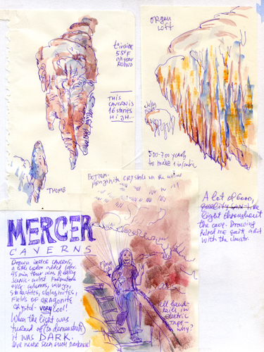
I do not like closed spaces. Do not. Really. You live on 12th floor? I will seriously consider taking the stairs. Tunnel? I speed-up like a maniac! But I had a chance to draw inside a beautiful cavern and as soon as I opened up my tiny book - things took a much much better turn! (Drawing helped almost as much as support form some wonderful companions! I am glad I took this walk underground! :)
Monday, July 25, 2011
Sandy Williams

Sometimes I just have to sit back and take a minute to wonder at today's communications and the internet. I'm so blessed to be living now when it's easy to reach out to people I'll probably never meet in person and still become friends. And look how it's changed our business communities! I am amazed!
New hand-bound journals!

This is what has kept me busy much of this past week...I was down to the last 5 pages of the current journal, and it was crunch time! So J. tore paper for me last week, and folded signatures, I sewed and glued them, and over the weekend did the covers for all seven.
I am ready to ROLL.

It's fun making your own cover paper...my favorite, at right, is the inside of an old Strathmore watercolor pad, which had an interesting ridgy texture! Originally I was just testing a Japanese Sumi-e brush, but it was so much fun...journal paper! That's an old & stamp from an early 20th C. stamp set, but since I ended up with the paper upside down, it looks like a very strange lower case B!
Had to do the maroon cover too, with the brush, the stamp, and splatters and sprays...
The bottom journal was what's left of an old grocery sack I wadded up, dampened, and inked...it and my favorite on the right both have my handmade bookcloth for the hinges/spines, too...
Saturday, July 23, 2011
What inspires you?
What do YOU turn to when the journaling seems more of a chore than a delight? When you begin to feel it's an obligation, not an essential part of taking care of yourself? When nothing seems to work out right? (Interesting that this should pop up just now...the Universe speaks to me, too!)
We've been discussing something similar over on our open Facebook group after a question from our own Laure Ferlita, with lots of terrific suggestions, but I wanted to get more in depth here...
First off, try NOT to think of your personal journaling as a chore, an obligation, a duty. I've seen more people apologize for not posting more often, or enough, or whatever. Don't, please. You'll make yourself crazy. (Trust me, I know. I've done it.)
You don't have to work every day, and you don't HAVE to share it. Try not to think "oh, this isn't good enough to show"...if you really don't like it, you don't need to share it! If it's private, if you need to express an emotion you find yourself worried about or using a word you wouldn't in polite company, fine! Use it anyway, express what you wish, get it out of your system (it may be blocking you!)--nobody says you have to post everything you do.
Or if they do, give 'em the raspberry!
That approach takes your personal artist's journal away from YOU and makes it public domain. You find yourself worrying about other people's opinions, and that is not what an artist's journal should be. You are an artist. It is your journal. Do what you want.
(Yes, I know I've said that before. I'll probably say it again! I'm still keeping journals after 40 years because I believe that.)
If scanning's a pain, try photographing, it's quicker. Upload from your smart phone, that's quicker still. If Photoshopping takes too long--resizing or tweaking your image to lighten it or increase contrast--try something simpler, like Picasa 3, Microsoft Office Picture Manager, Paint, or similar, even the software that comes with your smart phone.
Or just DON'T.
In other words, don't make it a chore. You don't owe anyone but yourself. (Do I need to hear that again myself? Yes, yes, I do.)
What inspires me is looking at work by artists I adore...those artists who are in the book, many of my favorite Flickr artists. and books that have been meaningful to me. Danny Gregory's books, and his An Illustrated Life: Drawing Inspiration from the Private Sketchbooks of Artists, Illustrators and Designers that I was fortunate enough to be included in, along with a SLEW of other artists who inspire me...and of course, Danny's first drawing book, Everyday Matters
 --and the Yahoo group and Facebook group by the same name (as well as Sketchbook Skool, where I am one of the teachers) that grew out of it!
I love David Gentleman's travel sketches, and have been rereading/drooling over David Gentleman's Britain, lately...you can click on the link or the cover below to "Look Inside." I'm eyeing David Gentleman's London at the moment, also recently released after some years. No "Look Inside" this one though, darn it...
He makes my fingers itch to get out there and sketch!

I'm having an Albany Wiseman droolathon right now, too...The Artist's Sketchbook below is my favorite, but I've recently found some of his early books that are a delight...
(And funny that my own most recent book got entitled Artist's Sketchbook! The writer almost never gets to pick the title of our own books...but this works.)


Artist's Hints and Tips: Drawing and Painting People is wonderful...as is Drawing Solutions
 , and his books on landscapes, and....well, lots more.
(Our dear friend and correspondent Laura Frankstone got to study with Wiseman at a workshop in Provence a few years ago...when I was looking for his books via Google, I found her blog post right up front! What a marvelous opportunity...)
Judy Martin's Sketching School (Learn as You Go) is FULL of wonderful art of all types (and yes, Wiseman's there too...) I drag it out at least once a year, just for the pure pleasure of it. It's a "look inside" book too, so you can click on the link above or the image below to browse. Remember, if you hit "surprise me" you see a LOT more...


Perhaps a stroll through a Flickr group will inspire you, or a visit to a real-life museum.
Try sketching from the Masters (most museums will allow that, if you work in pencil), or make a study of a sculpture you love. This is the Quanyin at the Nelson Atkins Museum of Art that I've visited ever since I was a kid. I plunked myself right down on the floor and sketched in that quiet presence. It was marvelous!
And of course just cutting yourself some slack, and PLAYING in your journal may be all that you need to really inspire you...draw how you feel, draw what you're thinking about, sketch what you wish you had or where you wish you were. Sketch the first thing that your eye falls on, draw a memory or a dream...
...and tell the Inner Critic to take a hike! You're NOT wasting time, and it doesn't have to be great art. This is a gift you give yourself.
Sooooo...what inspires YOU? Please share in the comments here...
We've been discussing something similar over on our open Facebook group after a question from our own Laure Ferlita, with lots of terrific suggestions, but I wanted to get more in depth here...
First off, try NOT to think of your personal journaling as a chore, an obligation, a duty. I've seen more people apologize for not posting more often, or enough, or whatever. Don't, please. You'll make yourself crazy. (Trust me, I know. I've done it.)
You don't have to work every day, and you don't HAVE to share it. Try not to think "oh, this isn't good enough to show"...if you really don't like it, you don't need to share it! If it's private, if you need to express an emotion you find yourself worried about or using a word you wouldn't in polite company, fine! Use it anyway, express what you wish, get it out of your system (it may be blocking you!)--nobody says you have to post everything you do.
Or if they do, give 'em the raspberry!
That approach takes your personal artist's journal away from YOU and makes it public domain. You find yourself worrying about other people's opinions, and that is not what an artist's journal should be. You are an artist. It is your journal. Do what you want.
(Yes, I know I've said that before. I'll probably say it again! I'm still keeping journals after 40 years because I believe that.)
If scanning's a pain, try photographing, it's quicker. Upload from your smart phone, that's quicker still. If Photoshopping takes too long--resizing or tweaking your image to lighten it or increase contrast--try something simpler, like Picasa 3, Microsoft Office Picture Manager, Paint, or similar, even the software that comes with your smart phone.
Or just DON'T.
In other words, don't make it a chore. You don't owe anyone but yourself. (Do I need to hear that again myself? Yes, yes, I do.)
What inspires me is looking at work by artists I adore...those artists who are in the book, many of my favorite Flickr artists. and books that have been meaningful to me. Danny Gregory's books, and his An Illustrated Life: Drawing Inspiration from the Private Sketchbooks of Artists, Illustrators and Designers
I love David Gentleman's travel sketches, and have been rereading/drooling over David Gentleman's Britain, lately...you can click on the link or the cover below to "Look Inside." I'm eyeing David Gentleman's London
He makes my fingers itch to get out there and sketch!
I'm having an Albany Wiseman droolathon right now, too...The Artist's Sketchbook below is my favorite, but I've recently found some of his early books that are a delight...
(And funny that my own most recent book got entitled Artist's Sketchbook! The writer almost never gets to pick the title of our own books...but this works.)
Artist's Hints and Tips: Drawing and Painting People
(Our dear friend and correspondent Laura Frankstone got to study with Wiseman at a workshop in Provence a few years ago...when I was looking for his books via Google, I found her blog post right up front! What a marvelous opportunity...)
Judy Martin's Sketching School (Learn as You Go)

Perhaps a stroll through a Flickr group will inspire you, or a visit to a real-life museum.
Try sketching from the Masters (most museums will allow that, if you work in pencil), or make a study of a sculpture you love. This is the Quanyin at the Nelson Atkins Museum of Art that I've visited ever since I was a kid. I plunked myself right down on the floor and sketched in that quiet presence. It was marvelous!
And of course just cutting yourself some slack, and PLAYING in your journal may be all that you need to really inspire you...draw how you feel, draw what you're thinking about, sketch what you wish you had or where you wish you were. Sketch the first thing that your eye falls on, draw a memory or a dream...
...and tell the Inner Critic to take a hike! You're NOT wasting time, and it doesn't have to be great art. This is a gift you give yourself.
Sooooo...what inspires YOU? Please share in the comments here...
Friday, July 22, 2011
Gouache, again...

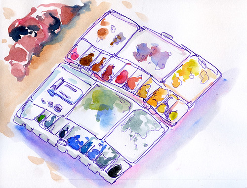
We posted recently about the new Caran d'Ache gouache paints, after Ruth asked what I thought of them and how they compared to other brands...
I hadn't tried them, but of course after reading about them, I HAD to...I didn't have exactly the same colors, so tried to use comparable for my tests, above.
At top is Caran d'Ache, next down is Pelikan, which I used to use a lot when I wanted portability, and at bottom a combination of various brands of artist-grade gouaches from M. Graham, Holbein, and Horadam, mostly, with a few old Winsor & Newton.
My old Pelikan didn't fare that well, in comparison to the Caran--even pre-wet, as I did all of them, it didn't lift and mix as readily, and the pigment is more transparent. (That's a Cadmium-ish yellow in upper right on the Pelikan page.
 |
| This was a plein air gouache painting from a few years back... |
 |
| ...and this appeared in Country Living magazine...state flowers! |

Of course weight is still an issue with me, as well as permanence and pigment density. The Caran box is quite a bit heavier than any of my home made gouache palettes, as well as being considerably larger. it weighs 13.5 ounces, my newer W&N converstion weighs 5, and the tiny box you see here weighs 2.5 ounces.
 | |||
| The new Caran d'Ache box is on the bottom...it'll probably stay home in the studio! |
Here is their helpful post:
Indeed in the past the boxes for this product were in plastic, now they are in metal. You can have these boxes in set of 8 or 15 colors. These sets are mostly used in schools in Switzerland and abroad. It is part of our Studio/Fancolor/Hobby line. This product contains a highly dense pigmentary concentration, in comparison to other products of this kind on the market.
Even though the product is of our Studio and Fancolor line, it is used by many professionals in all kind of artwork.
However the light fastness is not as high as the one of products from our artist line.
http://www.carandache.ch/m/la-couleur/enfants/les-peintures/fan-color/index.lbl
Here is also our web page for this product.
We hope this answers your question and thank you for your interest in our products.
With our Best Regards,
Daniela Costé
Caran d'Ache SA
Responsable Service clientèle
19, chemin du Foron
1226 Thônex-Genève
Switzerland
Tél. +41 22 869 01 15
www.carandache.ch
daniela.coste@carandache.ch
Thank you, Ruth, for sharing with us!
Thursday, July 21, 2011
Steve, again...

Sorry, all, I left out one of my favorites of Steve's paintings of lush, rich farmland, and just couldn't resist popping it into the blog anyway! Steve, can you describe a bit how you got these effects, please?
Stuck Again? I Try to Slow Down...
Whatever happens around me, slowing down and really really looking at things - and not on my paper helps me to get things in focus. Yes - it's tilted, curved and not exactly proportionate. But I had a very slow, very meditative time while drawing the contour. Plus a lot of fun splashing color all over it ;)
Wednesday, July 20, 2011
Meet our Interview #13-- Steve Penberthy!
I was fortunate enough to meet Steve in person; he's from one side of Missouri and I'm from the other, but he made it over to a sketchcrawl a couple of years ago, and we're looking forward to seeing him again!
I first "met" Steve on Flickr and fell in love with his bold colors and use of his sketchbook...I know you will, too!
So let's jump right in...
Q: How long have you been painting?
A: Other than the typical art-class stuff I did in high school, I really didn’t get too interested in painting until I took a watercolor class from a local community college in the early 1990’s; however, my interest in it quickly waned after several failures with the medium. However, like so many of the artists I meet lately, I was inspired to get back into the game by Danny Gregory’s “Everyday Matters” book; I received the book as a birthday gift in 2004 and, as a result, went out and bought a small watercolor field box, a sketchbook, and some Pigma Micron pens. I’ve been sketching and painting ever since, learning largely through books, self-study, and workshops.

Q: Why watercolor? What do you do for a living, and is it enriched by your art?
A: I’ll answer the second question first. I'm currently a software development manager; I have a degree in electrical engineering, and have worked in software engineering for the majority of my professional career. However, I’ve had an artistic bent all my life. I’ve jokingly stated, “I was voted Most Artistic of my senior class; therefore, I did the next most logical thing—I went to college and got an engineering degree…” which sort of sums up the dichotomous brain I get to live with. I’ve always been a person with insatiable curiosity and I’m very driven to master things that capture my interest, such as, electronic circuits, photography, and of course watercolor painting. Which brings back me to the first question: Why watercolor? I think my obsession with watercolor comes from that same curiosity and drive to master this medium that is said to be so challenging. In addition, while I’m nowhere near in mastering it, it’s those glimmers of a technique done right, a pleasing result, and an encouraging comment from an online friend that keeps me going in this enjoyable, lifelong pursuit. And watercolor is such a great medium because of its low barrier to entry—that is, the equipment investment is low: a brush, some paint, a piece of paper, and some water.


Q: What is your favorite subject?
A: It seems like I’ve attempted a little of everything here and there, but landscapes, figures, and light emerge as my favorite subjects. I’ve always been drawn to landscapes, not only in my painting but also in my photography. I enjoy the challenge of composing a landscape, since there are so many elements to consider. I’m also drawn to urban cityscapes and enjoy on-location sketching in these environments. Recently (and somewhat unexpectedly), drawing and painting people/figures has become another favorite subject. A few years ago, I began focusing on getting better at depicting light and shadow, and most of the examples I found at the time seemed to deal with how light hits the figure and the face. So, I started there, attempting more portraits and figure painting. I found a lot of challenge and enjoyment there, had some successes, and learned some great lessons along the way. As a constant reminder about getting light into my paintings, I have a piece of paper taped to the wall in my studio with, “Where’s The Light?” written on it. With regard to figure drawing/painting, I participate in a local life-drawing group, not only to keep my observational-drawing skills sharp, but also to engage regularly in depicting figures; in these sessions, I work in charcoal or graphite, but I want to start working more in watercolor than dry media. I’ve tried this with watercolor a few times, and it’s very extremely challenging! I encourage everyone to get involved in a local life-drawing group or classes; drawing the human figure is an extreme challenge and is a great way to train the eye and hand. Also, it’s great opportunity to meet other artists, see their work, and discuss techniques.

Q: Do you travel a lot? If it’s in relation to your work, do you make time to sketch and paint in off hours, or do you take special trips just TO paint?
A: I do like to travel; thankfully, I don’t have to travel in relation to my day job, so my travels are typically for vacations. When travelling, I typically take my portable travel kit so I’m prepared if I find some time to draw, sketch, and/or paint once I’m there. Many times, I only have enough time to take photo references and then create paintings from them once I’m home. The only time I’ve travelled expressly to paint is when I’ve taken workshops, but I would like to do more of this kind of travel in the future. However, on several occasions, I’ve traveled with my wife to her various conventions and, while she is attending her sessions, I hit the city with my camera, sketchbook, and paints in tow. I do some plein-aire sketching and painting and gather many photo references. I visit some interesting coffee shops and restaurants along the way and then head back to the hotel room in the late afternoon to do more painting. I find that I get a lot of work done this way and generate many ideas for new paintings. Since my art career isn’t my day job, I have to, as you say, make time to sketch and paint in off hours. This is the classic challenge to all of us who don’t create art as our main means of employment: finding time in off hours to make art and balance all the other things that need to get done. I keep a small sketchbook and supplies with me at all times, however, so I’m ready during the workweek to get in a little sketching during lunch if the opportunity presents itself. I normally create my on-location sketches and studio paintings during the evenings or on weekends.
Q: You do those wonderful small sketches right on the page…what are you aiming for with them? Exploring format, composition, drama, all of the above? How do you choose the one you want to use?
A: Those little thumbnail sketches get so much buzz on my blog and Flickr comments! Like many, I’m always tempted to just jump in and start splashing paint around, but stopping to take just a few minutes to draw these little thumbnails pays off greatly down the road, both in the sketch and any formal painting resulting from it. Drawing a single thumbnail only takes five minutes or less. The key is to draw them with a pencil, pen, or marker that gives me a full range of values. I find I get the darkest darks using ink pens or markers. 6B (or softer) pencils work fine too. The thumbnail sketch accomplishes several objectives for me at once: (1) it’s a place to work out different compositional possibilities. I draw rectangles that are approximately 1” x 1.5” (2.5 x 3.8 cm) in size, typically on the same page on which I plan to sketch, and divide them into thirds for a rule-of-thirds grid (I make my own homemade viewfinders with a 1.5:1 aspect ratio that are also gridded off in thirds; the grids on the viewfinder correspond to the grids in my thumbnails). In this way, I can experiment with different compositional possibilities that I may not have considered originally when approaching the subject, for example, moving the point of interest around and seeing how I like it. (2) It’s a place to play with different value possibilities. As much as possible, I like to design using value, putting a full range of lights and darks in my sketches and paintings. I make one thumbnail sketch, and then look to see if I like the resulting pattern of lights and darks. If not, I’ll draw another thumbnail and try something different. For example, what if the sky was the darkest dark? What if those distant trees were of a light value instead of a dark? Paths of light and dark lead the eye through the painting, so to improve things, I’ll often create lights and darks for design’s sake even if they don’t exist in the actual scene. (3) Finally, thumbnails give me a little place to practice drawing the scene. This practice is especially comforting when sketching plein-air; it makes that blank sheet of paper less intimidating, serves as a dry run before attempting the actual sketch, and gives me a better overall feel for the scene. Often, I use the thumbnail as the reference for my eventual sketch even more than the scene itself. In fact, there have been times when I’ve created a thumbnail without time to create the sketch on the spot, so I take a photo reference and, between the two, I can recreate the final watercolor sketch or painting accurately.

Q: Do you often work back in the studio from your sketches?
A: All of my sketches potentially serve as preliminaries for more-formal works; however, I'm also satisfied to leave a sketch alone as a work of art in-and-of itself. I do most of my sketches on location, en plein aire, but I have also done some sketching from photo references. When I do create larger, formal paintings, I use my sketches and photo references together to create a final work in my studio. Often I’ll augment a field sketch with some formal value sketches in pencil or pen as an additional pre-step before working on a formal painting.
Q: Do you show in a gallery?
A: I’m not represented by any galleries currently, but that’s somewhere I’d like to be in the near future. Currently, several of my paintings are on display (and for sale) at The Designing Block store in St. Louis. See http://www.thedesigningblock.net for more information.
Q: How does your blog enrich your experience as an artist?
A: There’s a time for every artist when he/she wants to get their art in front of people. My blog serves that purpose. I went online with my art blog in 2006. In addition to using my blog for displaying my art, I like to post items that are of interest to other artists, such as new materials I run across, interesting articles, or new techniques. I am also on Flickr (which is predominantly a photo-sharing website), and I find that there is a very strong representation of artists there. I really like Flickr for its true social-media functionality, such as Contacts and its robust commenting and “favoriting” capabilities. I think of Flickr as my gallery of work, and my blog as an ongoing conversation with readers, even though there are elements of each in both places.
Q: What’s your most memorable experience sketching or painting?
I attended an all-day workshop a few years ago that was strictly dedicated to sketchbook art. Surprisingly, the class was very small, only three students (including me), so the interaction and attention each of us received from the instructor was outstanding. The workshop strongly influenced the way I approach sketchbook painting, from subject matter to color mixing. My capabilities were greatly enhanced in that one day!
Q: Do you keep a journal per se? Do you make notes just relating to your image, or add other things?
A: My sketchbooks aren’t journals in the strict sense, but the collection of work that I create in them certainly creates a record of my various experiences. I can page through a sketchbook and remember everything about painting it, such as where I was, the sounds I heard, the process of painting it, etc… When I start a new sketchbook, I always paint swatches of my entire palette on the first page to document the pigments I’m using at the time. Any notes I make in my sketchbooks are typically for my own reference. For example, I often make little value notes on my thumbnails, using a four-value scale; for example, I’ll write the number 0 (zero), circle it, and then draw a line from the circle to the lightest value in the painting. I do the same with 1 for light-middle values, 2 for darker-middle values, and 3 for darkest darks. In doing so, it creates a little map for me as I start to work on my watercolor sketch. My sketchbooks also contain various color-mixing grids that serve as references. For example, one page of a sketchbook I’m currently using contains a color-mixing grid of my various yellows mixed with Payne’s Gray, which serves as a go-to reference for creating some gorgeous earthy greens.
Q: And, of course, anything you can think of that relates or is important to you!
A: My wife is always so supportive of everything I do; I truly couldn’t do any of this without her. In fact, she jokingly says that I’m the artist and she’s “Art Support.” In addition to drawing, sketching, and painting, I love playing guitar. I prefer to compose and play my own songs and I truly see the guitar as an additional canvas on which to create! Finally, thank you Kate, for this interview and for the wonderful opportunity to be part of this impressive project; I know your book will be a huge success!
------------------------
And thanks to YOU, and the other wonderful contributors, I think that will be the case, Steve, it's already surprised me! This was a terrific interview--and hope to see you again soon!
Again, don't miss Steve's Liquid Chroma Flicker: http://www.flickr.com/photos/liquidchroma-/with/2578737757/
and his wonderful blog: http://www.stevepenberthy.com/
 |
| I loved the sketch he did at the Historic Elms Hotel...I'd sketched this same set of stairs in the past, in monochrome, but this SINGS. |
 |
| This and the Elms, above, show how Steve typically uses his sketchbook...planning for future works, often, but delightful as they are! |
Q: How long have you been painting?
A: Other than the typical art-class stuff I did in high school, I really didn’t get too interested in painting until I took a watercolor class from a local community college in the early 1990’s; however, my interest in it quickly waned after several failures with the medium. However, like so many of the artists I meet lately, I was inspired to get back into the game by Danny Gregory’s “Everyday Matters” book; I received the book as a birthday gift in 2004 and, as a result, went out and bought a small watercolor field box, a sketchbook, and some Pigma Micron pens. I’ve been sketching and painting ever since, learning largely through books, self-study, and workshops.

Q: Why watercolor? What do you do for a living, and is it enriched by your art?
A: I’ll answer the second question first. I'm currently a software development manager; I have a degree in electrical engineering, and have worked in software engineering for the majority of my professional career. However, I’ve had an artistic bent all my life. I’ve jokingly stated, “I was voted Most Artistic of my senior class; therefore, I did the next most logical thing—I went to college and got an engineering degree…” which sort of sums up the dichotomous brain I get to live with. I’ve always been a person with insatiable curiosity and I’m very driven to master things that capture my interest, such as, electronic circuits, photography, and of course watercolor painting. Which brings back me to the first question: Why watercolor? I think my obsession with watercolor comes from that same curiosity and drive to master this medium that is said to be so challenging. In addition, while I’m nowhere near in mastering it, it’s those glimmers of a technique done right, a pleasing result, and an encouraging comment from an online friend that keeps me going in this enjoyable, lifelong pursuit. And watercolor is such a great medium because of its low barrier to entry—that is, the equipment investment is low: a brush, some paint, a piece of paper, and some water.


Q: What is your favorite subject?
A: It seems like I’ve attempted a little of everything here and there, but landscapes, figures, and light emerge as my favorite subjects. I’ve always been drawn to landscapes, not only in my painting but also in my photography. I enjoy the challenge of composing a landscape, since there are so many elements to consider. I’m also drawn to urban cityscapes and enjoy on-location sketching in these environments. Recently (and somewhat unexpectedly), drawing and painting people/figures has become another favorite subject. A few years ago, I began focusing on getting better at depicting light and shadow, and most of the examples I found at the time seemed to deal with how light hits the figure and the face. So, I started there, attempting more portraits and figure painting. I found a lot of challenge and enjoyment there, had some successes, and learned some great lessons along the way. As a constant reminder about getting light into my paintings, I have a piece of paper taped to the wall in my studio with, “Where’s The Light?” written on it. With regard to figure drawing/painting, I participate in a local life-drawing group, not only to keep my observational-drawing skills sharp, but also to engage regularly in depicting figures; in these sessions, I work in charcoal or graphite, but I want to start working more in watercolor than dry media. I’ve tried this with watercolor a few times, and it’s very extremely challenging! I encourage everyone to get involved in a local life-drawing group or classes; drawing the human figure is an extreme challenge and is a great way to train the eye and hand. Also, it’s great opportunity to meet other artists, see their work, and discuss techniques.

Q: Do you travel a lot? If it’s in relation to your work, do you make time to sketch and paint in off hours, or do you take special trips just TO paint?
A: I do like to travel; thankfully, I don’t have to travel in relation to my day job, so my travels are typically for vacations. When travelling, I typically take my portable travel kit so I’m prepared if I find some time to draw, sketch, and/or paint once I’m there. Many times, I only have enough time to take photo references and then create paintings from them once I’m home. The only time I’ve travelled expressly to paint is when I’ve taken workshops, but I would like to do more of this kind of travel in the future. However, on several occasions, I’ve traveled with my wife to her various conventions and, while she is attending her sessions, I hit the city with my camera, sketchbook, and paints in tow. I do some plein-aire sketching and painting and gather many photo references. I visit some interesting coffee shops and restaurants along the way and then head back to the hotel room in the late afternoon to do more painting. I find that I get a lot of work done this way and generate many ideas for new paintings. Since my art career isn’t my day job, I have to, as you say, make time to sketch and paint in off hours. This is the classic challenge to all of us who don’t create art as our main means of employment: finding time in off hours to make art and balance all the other things that need to get done. I keep a small sketchbook and supplies with me at all times, however, so I’m ready during the workweek to get in a little sketching during lunch if the opportunity presents itself. I normally create my on-location sketches and studio paintings during the evenings or on weekends.
Q: You do those wonderful small sketches right on the page…what are you aiming for with them? Exploring format, composition, drama, all of the above? How do you choose the one you want to use?
 |
| This is one of my favorites...it is SO atmospheric... |

Q: Do you often work back in the studio from your sketches?
A: All of my sketches potentially serve as preliminaries for more-formal works; however, I'm also satisfied to leave a sketch alone as a work of art in-and-of itself. I do most of my sketches on location, en plein aire, but I have also done some sketching from photo references. When I do create larger, formal paintings, I use my sketches and photo references together to create a final work in my studio. Often I’ll augment a field sketch with some formal value sketches in pencil or pen as an additional pre-step before working on a formal painting.
Q: Do you show in a gallery?
A: I’m not represented by any galleries currently, but that’s somewhere I’d like to be in the near future. Currently, several of my paintings are on display (and for sale) at The Designing Block store in St. Louis. See http://www.thedesigningblock.net for more information.
Q: How does your blog enrich your experience as an artist?
A: There’s a time for every artist when he/she wants to get their art in front of people. My blog serves that purpose. I went online with my art blog in 2006. In addition to using my blog for displaying my art, I like to post items that are of interest to other artists, such as new materials I run across, interesting articles, or new techniques. I am also on Flickr (which is predominantly a photo-sharing website), and I find that there is a very strong representation of artists there. I really like Flickr for its true social-media functionality, such as Contacts and its robust commenting and “favoriting” capabilities. I think of Flickr as my gallery of work, and my blog as an ongoing conversation with readers, even though there are elements of each in both places.
Q: What’s your most memorable experience sketching or painting?
I attended an all-day workshop a few years ago that was strictly dedicated to sketchbook art. Surprisingly, the class was very small, only three students (including me), so the interaction and attention each of us received from the instructor was outstanding. The workshop strongly influenced the way I approach sketchbook painting, from subject matter to color mixing. My capabilities were greatly enhanced in that one day!
Q: Do you keep a journal per se? Do you make notes just relating to your image, or add other things?
A: My sketchbooks aren’t journals in the strict sense, but the collection of work that I create in them certainly creates a record of my various experiences. I can page through a sketchbook and remember everything about painting it, such as where I was, the sounds I heard, the process of painting it, etc… When I start a new sketchbook, I always paint swatches of my entire palette on the first page to document the pigments I’m using at the time. Any notes I make in my sketchbooks are typically for my own reference. For example, I often make little value notes on my thumbnails, using a four-value scale; for example, I’ll write the number 0 (zero), circle it, and then draw a line from the circle to the lightest value in the painting. I do the same with 1 for light-middle values, 2 for darker-middle values, and 3 for darkest darks. In doing so, it creates a little map for me as I start to work on my watercolor sketch. My sketchbooks also contain various color-mixing grids that serve as references. For example, one page of a sketchbook I’m currently using contains a color-mixing grid of my various yellows mixed with Payne’s Gray, which serves as a go-to reference for creating some gorgeous earthy greens.
Q: And, of course, anything you can think of that relates or is important to you!
A: My wife is always so supportive of everything I do; I truly couldn’t do any of this without her. In fact, she jokingly says that I’m the artist and she’s “Art Support.” In addition to drawing, sketching, and painting, I love playing guitar. I prefer to compose and play my own songs and I truly see the guitar as an additional canvas on which to create! Finally, thank you Kate, for this interview and for the wonderful opportunity to be part of this impressive project; I know your book will be a huge success!
------------------------
And thanks to YOU, and the other wonderful contributors, I think that will be the case, Steve, it's already surprised me! This was a terrific interview--and hope to see you again soon!
Again, don't miss Steve's Liquid Chroma Flicker: http://www.flickr.com/photos/liquidchroma-/with/2578737757/
and his wonderful blog: http://www.stevepenberthy.com/
Sunday, July 17, 2011
A reminder and an invitation...
Hi all! We DO have a facebook group for artists who keep journals, and we'd be delighted to have you join us! It's the same name as this blog, to keep things simple, and you're welcome to add images from your own journal, make comments and ask questions!
You'll find it HERE...
Come play!
You'll find it HERE...
Come play!
Saturday, July 16, 2011
Full Thunder Moon
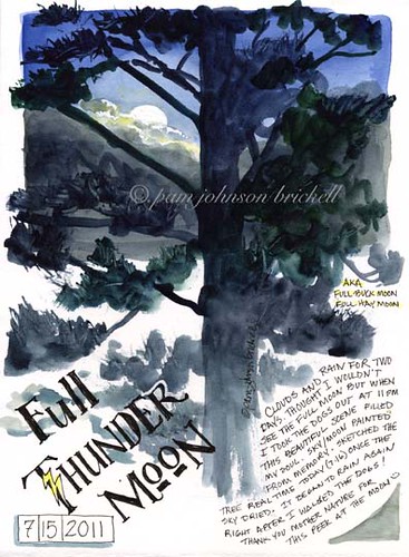
Full Thunder Moon, a photo by PJBee on Flickr.
This was the scene last evening when I took the dogs out for their last pee trip. I had written off being able to see July's full moon.... but the clouds parted briefly and I was there.... quite accidentally! It brought to mind the Lemony Snicket's line that I read on Jan Yates blog recently....
It is one of life's bitterest truths that bedtime so often arrives just when things are really getting interesting. ~Lemony Snicket
I painted the sky and moon from memory and the tree plein air today :)
Friday, July 15, 2011
Waterproof Test for Gel Pens

I rarely use a lot of words on my artist journal pages, but when I do, I like to make them pretty by changing colors with subjects, and or highlighting, backgrounding, or just decorating with watercolor.
If the ink smears, the writing is illegible. Not good.
Pitt and other pigment pens work fine, but the fine tip version does not come in many colors, and these tips do not glide over the page like gel pens will do.
I was very pleased to find the UniBall Vision Elite pens. They write beautifully and are purported to be waterproof. I had to test that of course . . .
See my post here:
jessica
Thursday, July 14, 2011
CD Giveaway...and the WINNER IS....
...Capt. Elaine Magliacane!

Congratulations, Elaine, and thank you for entering. I've emailed you privately for your mailing address, but if you see this first, write me at kate@cathyjohnson.info!
And thanks everyone else, for responding so generously! I put all the entrants from both blogs together in one pot, shuffled them thoroughly, and let Joseph draw the winning name!
We finally solved the glitch problem (though I'm not promising I might STILL have missed a typo!), and we're rolling again.
If you want the CD, of course you can find it on my website catalog, and we'll be having another giveaway soon of the OTHER new CD, so watch for it!
Pan Gouache, anyone?
Someone just asked me if I'd tried Caran d'Ache Fancolor pan gouache paints...I haven't, have you? Any input? It says it's artist-grade paint...(you can click the link above to read the product information.)
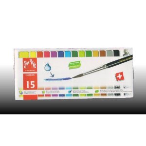 Here's a similar set, with fewer colors, though it says it's from age 3 up...
 Normally I squeeze tube gouache into my palette and let it dry to travel with--some brands re-wet better than others, and some want to crumble when dry, so of course I'm curious about these.
I've used Pelikan gouache like you see below, too, and although it's not as rich and saturated as artist grade gouache, it's still fun on toned paper...
 So anyone have any hands-on experience I can share with Ruth?
I've used Pelikan gouache like you see below, too, and although it's not as rich and saturated as artist grade gouache, it's still fun on toned paper...
Watch for Interview # 13--Steve Penberthy!
Hi all! Watch for Interview#13, up next! It's with my friend Steve Penberthy, from St. Louis, Missouri. You'll have seen his recent post to this blog, HERE.
Steve's sketch is on the back cover of the book, and it's terrific--as are the other examples throughout Artist's Journal Workshop!

You may have discovered his work as "LiquidChroma," which really fits Steve's wonderful, rich, singing color. I love how he plans future works in his sketchbooks, doing thumbnails and making a grid--and then exploding exuberantly OUT of it! You'll love what he has to say about his working methods...
Watch for the interview, you'll love it!
Steve's Liquid Chroma Flicker is here: http://www.flickr.com/photos/liquidchroma-/with/2578737757/
and his wonderful blog is here: http://www.stevepenberthy.com/
Steve's sketch is on the back cover of the book, and it's terrific--as are the other examples throughout Artist's Journal Workshop!

You may have discovered his work as "LiquidChroma," which really fits Steve's wonderful, rich, singing color. I love how he plans future works in his sketchbooks, doing thumbnails and making a grid--and then exploding exuberantly OUT of it! You'll love what he has to say about his working methods...
 |
| Look at the colors of those shadows! YUM. |
 | |
| I feel as if I'm right there, in that peaceful early morning... |
Watch for the interview, you'll love it!
Steve's Liquid Chroma Flicker is here: http://www.flickr.com/photos/liquidchroma-/with/2578737757/
and his wonderful blog is here: http://www.stevepenberthy.com/
Updated the classes and workshops page again!
Hi all...I just updated the page on classes and workshops again...
Heard from my dear friend and sketching buddy Maria Hodkins with her updated schedule...it's here in this post, and on the page so you can find it easily, later. I'd LOVE to take part!

MARIA HODKINS, JOURNALING INSTRUCTOR, WESTERN COLORADO
Maria teaches visual journaling, nature/field journaling, and bookbinding classes and workshops in Colorado, New Mexico, Wyoming, and Utah. For more information, check her website: www.windword.net
Here's her brand new schedule!
UPCOMING SUMMER & FALL CLASSES
AUGUST 5-7 - THE ART OF THE NATURE JOURNAL
at Caribou Ranch and Mud Lake Open Space, Nederland,Colorado
http://www.botanicgardens.org/sites/default/files/2011Botanical_Illustration_SummerFall.pdf (scroll down to Elective Courses)
AUGUST 13 - SKETCH YOUR VEGGIES--AND EAT THEM TOO!
at Aspen Center for Environmental Studies, Aspen, CO (Rock Bottom Ranch)
http://www.aspennature.org/programs/sketch-your-veggies-and-eat-them-too?pid=214
AUGUST 15 - HAND MADE NATURE JOURNALS
at Aspen Center for Environmental Studies, Aspen, CO (Hallam Lake)
http://www.aspennature.org/programs/hand-made-nature-journal?=214
AUGUST 16-17 - THE ART OF FIELD SKETCHING
at Aspen Center for Environmental Studies, Aspen, CO (Hallam Lake)
http://www.aspennature.org/programs/%5Btitle-raw%5D?pid=214
SEPTEMBER 17-18 - SPIRIT OF PLACE: CAPTURING TIMELESSNESS THROUGH ILLUMINATED JOURNALING
at Aspen Center for Environmental Studies, Aspen, CO (Toklat)
http://www.aspennature.org/programs/spirit-place-capturing-timelesssness-through-illuminated-journaling?pid=214
Tuesday, July 12, 2011
Making Fresh Strawberry Jam, Drawing it and Taking a Photo!
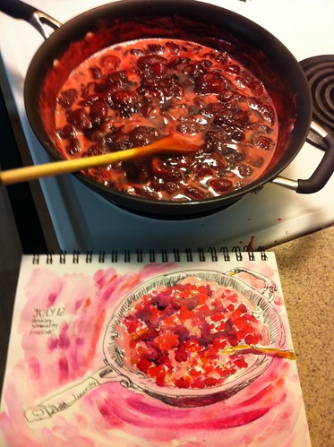
One of the things I enjoy in journaling is recording my sketching process - it's fun to look back and see what worked, what not, it's fun to compare with the "source" and it adds another dimension to the whole experience for me :)
Monday, July 11, 2011
Sorry for the delay while I deal with a dinosaur...
I know I said we'd pick the winner for the CD today, but although J. said I shouldn't even call it a prototype because there weren't any glitches, I found to my dismay (from some kind person who BOUGHT one!) that there were, indeed. ACK. We thought it was done, honest we did.
So. The dinosaur is unfortunately my MovieMaker 2.6, which keeps hanging up and leaving things out. I've been working for two days to try to solve the problem...but unfortunately they're DIFFERENT things, each time.
And each time I go to fix it I find another typo...so might was well clean those up while I'm at it....
I've even uploaded a new version of MovieMaker to let it repair itself. That was yesterday...
I'm going to switch to a newer movie-editing software as soon as I get this one DONE (rats, thought I was!), but the project itself, pre-slideshow/movie IS finished--and there doesn't seem to be another software out there that can read it. (Believe me, I've tried!)
Soooo...sorry for the delay! Technical difficulties...
Plein Air "Workstation" for "On the Grounds at the Elms"

I hope all of you are enjoying your copy of Kate's "Artists's Journal Workshop" as much as I am! It's an incredible resource, and I'm awed by the talent and information in the book.
It occured to me that I had a photo of my watercolor setup for the "On the Grounds at the Elms" sketch, so I thought it would be fun to post it here. Also, here's a link to the photo on my Flickr site: http://www.flickr.com/photos/liquidchroma-/2578737757/
Enjoy!
Steve
Saturday, July 9, 2011
NEW CLASSES from our correspondents!
What great opportunities to learn!
I've just updated our "Classes, Workshops, etc." page to include new classes from Sandy Williams, Jessica Wesolek, Laure Ferlita, Gay Kraeger, Maria Hodkins, and my own mini-classes.
You can also still access the free Strathmore journaling classes, the last of which was from our friend and correspondent Roz Stendahl.
Some of these are online, some are DVD or downloadable, some come to you as PDFs, and some are in person.
Don't miss these! Click the page at upper right, or go to the direct link: http://artistsjournalworkshop.blogspot.com/p/classes-etc.html
Wednesday, July 6, 2011
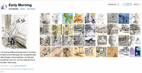
Early Morning Sketch-Time
I sketch whenever I can. But the more I sketch in the early hours of day the more I like it.
Before everyone is up.
Before light is sharp.
Before voices are loud.
I just organized my early morning sketches in a separate set:
http://www.flickr.com/photos/23173190@N07/sets/72157626969901047/
I often don't even scan my morning sketches - sometimes they are too private, sometimes not good - but they get me going!
Christmas....In July?!

So this year, I decided to do a MINI Christmas In July class! You can find more information here. It's a 4 week class with a creative prompt each week as well as a video demo covering some aspect of making the artwork card-ready for the holidays.
Come and join the fun! Class starts tomorrow.
Tuesday, July 5, 2011
GIVEAWAY!
As some of you know, we've been working to solve the problem CafePress threw in our laps the other day when they announced they'd no longer be producing CDs--our biggest seller!
SO....Joseph's been doing some prototypes to see if we can do it ourselves (we CAN!), and because we've changed something here or there on the cover or on how the files are organized since then, we're offering these prototypes as giveaways!
Here's the first offering...my first in the Elements of Landscape series, Painting and Drawing Trees, with a slideshow, PDFs, jpegs, and other goodies.
Make a comment here on the blog, and we'll pick the winner next Monday! Free shipping, too. (I'm putting this on my Fine Arts gallery blog too, but we'll compile names--we won't miss you if you sign up one place or another!)
Of course this and all the other CDs are available on my website, right now. After all these years, I'll be closing my CafePress store at the end of July, but the CDs will be available right here: http://www.cathyjohnson.info/cds.html
Who needs Cafe Press??
SO....Joseph's been doing some prototypes to see if we can do it ourselves (we CAN!), and because we've changed something here or there on the cover or on how the files are organized since then, we're offering these prototypes as giveaways!
Make a comment here on the blog, and we'll pick the winner next Monday! Free shipping, too. (I'm putting this on my Fine Arts gallery blog too, but we'll compile names--we won't miss you if you sign up one place or another!)
Of course this and all the other CDs are available on my website, right now. After all these years, I'll be closing my CafePress store at the end of July, but the CDs will be available right here: http://www.cathyjohnson.info/cds.html
Who needs Cafe Press??
Fountain Pen Q & A!
This is not our normal Artist's Journal Workshop post, and we have one of our readers to thank for that! I hope you enjoy it as much as I did.
Regular Reader Chris Fitzgerald asked some terrific questions about fountain pens, and since we've had a number of recent posts about several types, I decided to include the conversation here. I asked fellow ink-pen posters Nina Johansson and Laure Ferlita for input...and here's what we all came up with.
Chris wrote:
I am a fountain pen newbie. Oh, I own a lovely Rotring artists pen set which is probably as we speak ruined because the constant cleaning required to keep it from seizing up just wore me out. (And it was very scratchy) So I set aside ink pens. And frankly I could never find cartridges for it in a color I liked anyway.
And indeed we could, and did! Read on...
------------------
My first response...
----------------------

------------------

Regular Reader Chris Fitzgerald asked some terrific questions about fountain pens, and since we've had a number of recent posts about several types, I decided to include the conversation here. I asked fellow ink-pen posters Nina Johansson and Laure Ferlita for input...and here's what we all came up with.
Chris wrote:
I am a fountain pen newbie. Oh, I own a lovely Rotring artists pen set which is probably as we speak ruined because the constant cleaning required to keep it from seizing up just wore me out. (And it was very scratchy) So I set aside ink pens. And frankly I could never find cartridges for it in a color I liked anyway.
Now I'm tempted by the new Noodler pen. It's cheap, and it sounds like a beginner could learn with it.
But as I read about pens on the blog and FB I realized that all the pen terminology is waaay over my head. I was reading Nina's blog recently, and she talked about lovely vintage pens and their various good and bad points.
So let's say I buy a Noodlers and get comfortable. I want to buy something pricier at some point. Do they COME with certain nibs or do you have to ask for a nib that's good for drawing. And which nib might that be? I see calligraphy nibs, nibs with letter designations. I have NO idea what all this means.How do you evaluate a pen? I realize it's highly personal depending on your "touch".
What is the world is a "wet noodle" that Nina referred to, and how do you decide if that's what you want?
How pricey would rehabbing an old pen really be? Nina thought it was worth it for her, but I look at prices on Ebay and wonder.
So I guess I am requesting a post with some basic pen facts and terms laid out for the newbie. Can you do that?
And indeed we could, and did! Read on...
------------------
My first response...
 |
| Here are some of the pens we've explored here... |
Hi Chris and thanks for the great questions!
I’d definitely recommend trying the Noodler’s if you want a variable line, but I also love the lightweight, fine-point little Carbon pen I recommended earlier, which takes cartridges.

The calligraphy pens/nibs take some getting used to, especially as some nibs are just straight across and some have a bend like the one Laure did the video on. I’ve used both, for different purposes.
I’d definitely recommend trying the Noodler’s if you want a variable line, but I also love the lightweight, fine-point little Carbon pen I recommended earlier, which takes cartridges.
 |
| I ended up getting three of these and cutting the long handle off to fit the way I work...the cap wouldn't stay on that long, skinny end, anyway... |

The calligraphy pens/nibs take some getting used to, especially as some nibs are just straight across and some have a bend like the one Laure did the video on. I’ve used both, for different purposes.
 |
| On the far right you can see marks made by my antique Waterman pen I had rehabbed...and a comparison with newer pens! |
I’ve had a couple of antique pens rehabbed here in the US, and it has cost about $40 each…not cheap, but it DID make them like new, mostly. Your mileage may vary, it depends on where you have them fixed. This is a lovely lady who works with a local pen shop in Crown Center, in midtown Kansas City. (Read on to find out about Nina's antique pen rehabs.) Unfortunately some of the vintage pens on eBay go for WAY too much to make that practical!

I love the dependable new Waterman Phileas pens, if you can find one fairly inexpensively on eBay. I got one new in the box for $9.99 once (YAY), but another one cost me $40, and I’ve seen them for $70+…shopping around is definitely worth it! It’s NOT very flexible, but it’s a workhorse.
The TWSBI pen I also found on eBay is a workhorse...a bit heavy for me, but very smooth and sturdy. I just leave the cap off while working! (I don't see one of these particular pens on their site at the moment...I believe it's called a Diamond.)
The TWSBI pen I also found on eBay is a workhorse...a bit heavy for me, but very smooth and sturdy. I just leave the cap off while working! (I don't see one of these particular pens on their site at the moment...I believe it's called a Diamond.)
Lamy Safari or Vista (that’s their clear model) pens aren’t flexible either, but very dependable and affordable. I like the black nib, it’s smoother than the silver/steel one. You can find these at JetPens.com, Amazon, eBay or all over the place...
You do normally have to buy a pen with the nib you want, extra fine (if they offer it), fine, medium, broad or calligraphy.
You do normally have to buy a pen with the nib you want, extra fine (if they offer it), fine, medium, broad or calligraphy.
----------------------

Nina responded with some terrific answers...
Good questions indeed, and a good idea to make a post about it! And I think you covered most of it in your answers, but I´ll add some too. The terminology questions are good, I don´t think most people know what all those words mean...
-do fountain pens come with a certain nib or can you change them into the nib you want?
Of the models I have tried, only Lamy Safari (and it´s cousins using the same nibs) has a nib you can change yourself. Good if you drop it and break the nib, or if you just want to change the width.
Others come with a nib you can´t change. As for old pens, only a repair could possibly fix a broken nib or change it into something else (as was the case with my old Wahl-Eversharp).
There are some possibilities to customize nibs, though, but they do cost. The place where I bought my new Pilot Namiki-Falcon, www.nibs.com, can customize the nibs on some of the pens they sell. That doesn´t mean they change the nib, they just treat it so it gets flexier or thinner or more like a calligraphy nib, or... whatever it is that you want.
-what is a 'wet noodle'?
A fountain pen that is super flexible and quite easy to flex, and thus reacts to every change in pressure that you make with your hand. Not for people with shaky hands, perhaps. ;)
-how do you know if you want a wet noodle or a steadier nib?
Hm... yes, that IS a matter of personal taste. I´m a newbie too with flexible nibs, but I guess the best thing is to try the pen before buying it, if possible. Doodle some on a paper. I love the flexible nibs I´ve tried, but they do take some getting used to - especially the easily flexing ones.
-expensive to 'rehab' an old pen?
about $70 for me for each pen. Plus the new nib on the Wahl-Eversharp - vintage gold nibs don´t come for free... Totally worth it for me, since I found the pens in a box so I didn´t pay anything for them. :)
That´s about it. Looking forward to the post!
Best
/Nina
------------------

And here are Laure's answers...
I too have wondered about some of the terms bandied about and what I did to begin educating myself was to join The Fountain Pen Network. I did/do a lot of lurking, and a whole lot of reading. Make no mistake, these are mostly serious pen collectors with few visual artists among the crowd, but the knowledge you can gain is worthwhile. It may save you from making a costly mistake down the road.
There are different forums on pen brand, ink, general writing instruments and whatnot. They're usually pretty tolerant of newbies' questions as well. Opinions and passions run deep over there, so I find it best to read along rather than get into the discussions.
Another educational site is Richard Binder's web site. He has a fairly extensive glossary of terms used with Fountain Pens.
Re: Rotring Pens - the set I have (ancient) had/has a whetstone as part of the set. The nibs have to be "smoothed" from time to time. Not sure why, but it is necessary to smooth them for them to work well.
For someone just starting out with thoughts of buying a fountain pen, I'd ask the following questions:
- Do you draw in ink now?
- If so, what tool do you use most? Think about what you like best about it and what you'd like to be different.
- Using a fountain pen of any type takes a certain amount of "dedication" or else you wind up with a useless instrument.
There are many inconveniences to using a fountain pen. Are you willing to put up with having to use it on a very regular basis, flush it often (depending on the ink used), refill as needed and put up with its temperament? Make no mistake, all fountain pens have a personality! Are you willing to find ways of traveling, as well as storing, with the pen nib upright so it doesn't clog? Do you travel with your pens and sketchbook? How will you transport ink if you don't use cartridges? Are you willing to put up with a few leaks and inky fingers from time to time? In other words, how much inconvenience are you willing to put up with for a great tool?
I think it's very important to understand how you sketch and how you will use the pen before leaping into the fray. If time is an issue, fountain pens may not be the way to go—that take time. If travel is required, again, FPs may not be the way to go as they do leak and can be messy. If you don't really use pen in your work that much, don't like the inconvenience or area irregular sketcher/drawer, grab a Micron or a Copic marker and save yourself the headache and expense.
If you want to have a go, I think starting out with a Noodler's Fountain Pen is a great way to go. It's more fun than the "nails" (a nib with NO flex what so ever) in most modern day pens. Lamy is another great pen company with lower priced but good quality pens without flex nibs. Some Hero (another brand) have flex to the nibs and are an inexpensive pen. You can find them on eBay. Read the descriptions carefully.
One last comment on buying pens....they "holy grail" of pens for those with more of an artistic want to their needs is a "wet noodle." A nib that lays down the finest of lines and the thickest of lines with the slightest of pressure. It does it consistently and the ink laid on the paper is consistent rather than going from light to dark. These nibs are from yesteryear and are usually quite expensive.....even if you purchase one, are you likely to take it with you to go sketch on location where you run the chance of dropping (thereby damaging) or losing the pen or are you housebound with the pen to keep it safe? (Once again, it's great to know yourself, your work habits, how often you drop things, lose things before purchasing an expensive pen.)
Re; Ink....There are a number of companies offering more ink samples than you will know what to do with....again, I think it's key to know how you will sketch/draw/write before buying samples. What's your favorite color, do you want to watercolor over it, do you want to do grayscale work, do you like old sepia tone looks, etc. As for beginning, I'd start with a waterproof and a non-waterproof ink in either black, gray or brown. After some experimenting, I'd look around to see what else I might like.
The reason for the caution on the inks is because all inks do NOT behave the same in every pen! Some inks will make a pen "dry" and hard to write with while another ink in the same pen will cause no problems with dryness. There are inks that are "wetter," and flow better, but again, this depends to a great degree on the pen in use. (Example: I have Noodler's Lexington Gray....the first pen I put it into, the ink came out very wet and so it dried very dark. Almost black. I blamed the ink and decided I didn't like it. Then I put it into a second pen and what do you know, it was gray! The second pen is "drier" so I don't get as much ink on the page and it dries lighter.)
~ L
Subscribe to:
Posts (Atom)