28 ARTISTS & JOURNALISTS
their work and words, interviews, blogs, images, hints, tips, websites
and more...

Sunday, February 27, 2011

Another Lettering Book!

Cheryl Gebhart, one of our regular readers, commented on THIS POST--she also suggests The Scrapbooker's Handwriting Workshop: 20 Unique Fonts to Practice and Play With (oops, out of print**) and it DOES look like fun!

**NOTE: I had the wrong link--this edition is NOT out of print: The Scrapbooker's Handwriting Workshop: 20 Unique Fonts to Practice and Play With


It's on Amazon, with the "Click to Look Inside" option, so I did.  (Don't forget to hit "Surprise me," you can see a lot more.)

Has anyone else used it?  Cheryl, can you tell us more about why you like it?

I can see I'm facing temptation again...

Saturday, February 26, 2011

Customizing your gear...a new gouache box!

Just because something comes to us as one thing doesn't mean it has to STAY that way, if it doesn't work for us.  Don't get rid of it till you give it a good hard look and see if you can work a conversion!


I loved this little Winsor & Newton watercolor box, except for a few drawbacks that made it end up neglected in a drawer...I don't like half pans, because I prefer the option of painting a nice juicy wash with a big brush, and half pans just don't cooperate for me. 

I also didn't care for the wee water dish...I made a seriously muddy painting trying to use this as it came from the manufacturer, so it got retired.

But it was lightweight and had nice mixing areas, so I just couldn't quite let it go...


I was looking at it the other day and ah-HA, realized that I could pop those tiny half pans right out...


I considered putting the paint directly in the double-half-pan size holes that were left...but I like to be able to change out my colors if I want.

Full pans were just a hair too big...till Joseph nipped off the little niblets at the top of each pan.  He cut them off with his handy Swiss Army Knife--just the top two--and a full pan fit perfectly.  I fix mine in place with rubber cement so they stay put but can be easily changed out when I need a new color.  (This Alizarin Crimson at upper left will go as soon as I find a replacement...it's muddy.)


I opted to use a warm and cool of the reds and blues, a single yellow, a burnt sienna for neutrals, and keep half pans for colors I don't use often--black and white.  (Wished I had indigo or Payne's grey instead of black, but...I don't!)

I used M. Graham and D. Smith--OOPS, meant Horadam Schmincke!--gouache, mostly...


The top offers a nice mixing area, and a sliding tray beneath gives you another one...the silly water cup that fits on the side is next to useless, though! Too easy to spill, too...


Sooooo...I used an old 35 mm film can fixed in place with a bit of blue sticky-tac and I'm ready to go.  I've even got two folding travel brushes that fit just fine in the brush trough above the pans of paint.  I'm ready to get OUT there with my gouache!

Drawing tricky subjects--hands!

We were talking about drawing hands the other day, and I remembered someone suggesting you think of the hand shape as a mitten, first, simplify it to that form, THEN add fingers and thumbs and details.  So I decided to do a couple of quick demos.  (And yep, I turned over my mug of coffee, but I don't like to waste paper!  These are leftover sheets from my bookbinding project, cut to handy demo size. 

Most of them are still coffee-free...


I was able to see the foreshortened forms easily this way...but my thumb's still a bit short too!
More playing with mitten shapes and tricky hand positions...


You can see where the "mitten" lines were...and also see that I've got a bit of arthritis!

Tweak as you need to, nobody says you HAVE to stay within the lines if you see you need to correct a bit, but it DOES give you good guidelines...

Thursday, February 24, 2011

Interview #7--meet Alissa Duke!!

Alissa Duke is keeping busy these days--she's one of the artist-journalers in the upcoming book that originally gave birth to this blog, of course, and she was in Watercolor Artist Magazine this month (in the April issue, you know how magazines are).  She's one of the correspondents on the Sketching in Nature blog, and is also involved in the Sketchabout at the Royal Botanic Gardens, as we mentioned in THIS post!  We figured this was the perfect time to do the interview with her...

11Feb11 Sketchabout sketchbook cover

Soooo...in her own words, here's Alissa!

--------------------------

I was born in New Zealand but lived all of my life in Australia. I grew up in large regional city called Toowoomba and then spent most of my adult life in Brisbane, the capital city of the state of Queensland, Australia. 


Looking back, our household was a creative one with lots of craftwork and I also entered the local paper drawing competitions, often winning a $2 or $5 money order!  I started drawing when I was at high school and I did art as a subject at school, but was not particularly good at it. My best friend and I would draw after school and on weekends- mainly drawing 1980’s pop stars, copied from magazines. I drew irregularly after I completed school and it was always copying from pictures. Only in the last eight years I have been drawing from real objects and scenes.  

I moved to Sydney six years ago for work (I am a Librarian/Researcher) and am still enjoying exploring my ‘new’ city.


19Feb11 Art Gallery lunch


How did you get started journaling?

I have been drawing on and off since I was a teenager. In late 2008 I started to draw when travelling and when participating in Sketchcrawls and I write along side of my drawings. I would make note of the place or object (often food) I was drawing. I also started sketching in Moleskine watercolour sketchbooks.   

Currently on my sketch page I sometimes write a small commentary about the place and event I am drawing. Often it is just capturing my own reaction at the time.

There are often people about, but Alissa manages to concentrate on her drawing...

Do you feel comfortable working in public? 

Yes, I do now, although it has taken some time and I still stand or sit out of the way. I am not yet comfortable with looking at people and drawing them, so I usually draw them from the back or the side.

How often do you meet up with other artists to sketch?  How did that come about?

I draw with others Sydney sketchers regularly, and sometimes it seems to be every weekend ! I met my fellow sketchers Liz, Wendy and Annie in 2008 at International Sketchcrawls . Liz and I were the only ones there at a Sketchcrawl in June 2008 and spent most of the day chatting as well as drawing.

I have more recently become one of the two Assistant Organisers with the Sydney Sketch Club, which is a Meet Up group. We sketch around Sydney at various places, with anywhere from 2 to 18 people turning up. 

from the Royal Botanic Gardens
*NOTE: Alissa's recently gotten involved in a wonderful new project at the Royal Botanic Gardens
as we mentioned up top--read her account at the link!


You’ve done a lot of birds and animals…do you enjoy them most. Or what’s your favorite subject?

When I look through my drawings from the past two years (in thirteen Moleskine watercolour sketchbooks, which sit in my bookshelf) there does not seem to be a particular subject that features. Perhaps I do more objects, rather than larger scenes, although as a member of Urban Sketchers, I hope to become more practiced at drawing places as well. However, I do enjoy drawing birds and animals. They have such character!  I seem to go through stages and themes with my subjects:   animals, places, family history, objects around the apartment:  too many things to draw and not enough time !!!

This magpie looks like he could hop right off the page!

I can become enthusiastic about any subject if it is part of a project or theme. That’s why I love the EDM group, Illustration Friday.. Sketchbook Project, EveryDay In May etc.  Only recently I realised that I used to previously waste so much time trying to find the “right” object or view or scene, sometimes, often I ended up not drawing anything at all. I have only recently got past that and I think that is why I can now sit down and attempt any subject without much fuss.


Do you do all your sketching on the spot, or finish some back in your studio?

If I am going out sketching, I will do most of my drawing on the spot (writing notes in pencil) At home I will add a little more colour, write my journal commentary in ink and format the page a bit. I don ‘t often take a photo to complete later, although this will depend on the situation. At a dinner with non –sketching friends I might take a photo of dessert so that I can draw a page to record the occasion when I get home. And I do have a shoebox full of ‘source photographs” to use if needed. 

Sometimes I will take a found object home to draw, such as a feather or leaf. Otherwise, I draw at my desk, with the object propped up in front of me.

I had to laugh when you asked if I draw “back in my studio”. I live in a studio apartment, so my beautiful (ergonomically incorrect) silky oak dining room table is my art desk, which constantly has my watercolour pencils, sketchbook spread over it. It is also my computer desk, dining table and “everything else” table. 


This is one of the family history images that will appear in the book.

Tell us a bit about the family history project...

My great aunt died in 2008 and I became aware of some fascinating objects that had belonged to her and my great grandfather's family , including WW1 medals and badges, photographs, letters and other objects. I been previously researching the family tree and began with the idea of trying to visually document possessions in my family. I decided to draw each object and then find out about the history of it and add some commentary to the page. The next stage will then be to add some notes about the person and that time of their life. In this way I hope to show them as a real person and to create a record of a part of my family history that would otherwise be lost


What's your favorite, most satisfying medium, and why? 

Watercolour pencil. I really don't have experience with many other mediums. I have been using watercolour pencil for about two years. They are excellent for sketching while travelling as I can take and use them anywhere. I can either use them as the main medium or just to add a wash to a pen drawing. Previously I have only used graphite pencil and some ink pen.

Watercolor pencil and graphite

I notice you're branching out a bit into ink and watercolor...tell us a bit about that?

I like the looseness that an ink pen can potentially provide me and I would like to be able to use it like a pencil.  It could be that I am influenced by drawing with Liz Steel , who uses ink so confidently on the page.
 
Ink doesn’t suit all suit object or pages. Ink does give a consistency of style over a number of pages of drawings. So the pages where I am journaling more, I will tend to use the ink pen. And you know that I have just discovered the Lamy Safari Joy ink pen with a nib. The nib provides a lot more flexibility of line on the page, which I  couldn’t get using Art Line, Micron., Pitt Pens etc 

This is one of Alissa's recent images with her new pen!

Other thoughts? Whatever else you feel is more important, personally, to YOU...

Drawing and journaling allows me to focus and use the creative and artistic force inside me. I can try to capture a place or time as only I experienced it, through a creative process that I love. It also
makes me look and think more and appreciate things more.


This is one of my favorites from the Sketching in Nature blog, where Alissa's a correspondent.

-------------------


Thanks, Alissa!  And I hope you all have enjoyed this interview--there are many more to come, so stay with us...


Wednesday, February 23, 2011

Evolving pages...


Journal pages evolve and take on a new life from what you'd originally envisioned.  This was going to be a very rough, quick sketch of the pods I found in a couple of square yards behind my shed, but I got fascinated by shapes and textures and ended up doing much more detail than I'd planned.  I thought it would be fun to do the shadows, though...and then, of course, some lettering for the date, and the notes and block of color to the right, and a border, and spatters, and.....................


Then I kept looking at that rich maroon of the vinca leaf--it had twined up the tree and made berries for the first time I'd noticed...


And it just seemed to need that touch of color.  So...I added the maroon leaves and raw sienna berry husks, and then a little warm spatter to pick up the maroon, and punched up the lettering, and....

I THINK I'm done, but who knows.  Yesterday I went back and tweaked a page I did weeks ago!

Monday, February 21, 2011

sketching at church . . .


sketching at church . . .
Originally uploaded by vickylw
. . . while listening to the message. Drawing helps me concentrate on what is being said (rather than my eyes wandering around -- I'm such a visual person!) When I look through the sketchbooks later, I find myself remembering what was taught because I was more fully "in the moment".

(I add color later at home.)

Ours is a small, non-traditional church that started as a house-church. We don't sit in pews facing one direction --- we sit in a circle. So everyone can guess that I'm sketching as I write down sermon notes.

Intimidating.

Working fast in your journal...on the spot!


I did this mini-video a couple of years ago, and was just watching it again since I'm doing an art tip on painting still water. I DO work in my journal for a lot of plein air painting...I enjoy working on the spot, at lot, and doing it right in my journal preserves these special times.

I made a new set on Flickr recently of journal sketches I did in one favorite place, a decrepit barn near the Missouri River.  You can find it HERE.

How do you use YOUR journal?  Mine's a place for everything...sketches, notes, paintings, whatever I feel like...

Sunday, February 20, 2011

Mid-February Happenings


Mid-February Happenings
Originally uploaded by PJBee
This started as a memory sketch and ended with a plein air sketch. Did the lettering today. Signs of Spring are everywhere :)

I've been so taken lately with the contrast of colors in this mid-February and mid-winter landscape. The grasses; both lawn and marsh have reached their most dead and dull coloration. The blue of the water on sunny, blue sky days is absolutely brilliant and such a shock to your eyes. Red maples started to pop a few weeks ago so I splattered some red on the page :) It will mean nothing to someone who may thumb through my journal in years to come, but I will know :)

Saturday, February 19, 2011

Interview # 7--up next, Alissa Duke!


Everything's happening at once for Australian artist Alissa Duke! I was privileged to feature her work in the new April issue Watercolor Artist Magazine, in an article on watercolor pencils; she's terrific with fur, feathers, landscapes and more with that sometimes tricky medium. Don't miss it!

She and our own Liz Steel, plus sketching buddies Wendy Shortland, and Annie McMahon have been asked to work with a Sketchabout at the Royal Botanic Gardens in Sydney--they've even been filmed!  There will be more about how this came about in the interview, but for now, read more about the project HERE and HERE.  (Makes me wish I could book a quick trip to Australia, where it IS autumn, right now...)

A correspondent on the Sketching in Nature blog as well as this one, Alissa's a delightful and thoughtful artist...watch for her interview, up next!

Friday, February 18, 2011

Got new journals bound...


We all seem to be of two minds about a brand new, pristine journal, especially a handbound one!  Since I make my own, it may be a tiny bit less of an issue, but sometimes we're a little intimidated by that First Blank Page.  Clean, snowy paper.  Full of possibilites...full of.....................blank paper!

What do YOU do to get past that fear of white paper?  I wrote a whole article about that once, and if I can find it, I'll post it!

You saw Fred Crowley's opening page last week; Liz Steel often sketches her current paint set as a first page...if you've got a tradition like that, go for it! 

Add a quote you like, and illustrate it. 

Draw the first thing that comes to mind.

Or skip a few pages, and let the journal itself tell you what to put there.

Do be sure to add contact info either in the front or back of your journal so it can be returned to you if lost.  I know several people who have been VERY glad they did that.

Personally?  I'm excited about having all these choices, now, and can't wait to finish the last three pages in the one I'm using!

Thursday, February 17, 2011

Quick Snow Sketching

A couple of days in snowy mountains for someone usually sketching in sunny California is a big change. All of a sudden my trusty purple ballpoint pen is not working, water is almost freezing in my brushpen, hands are cold even in my gloves and I get almost waist-deep in snow trying to find a better angle ;) So as a result - I draw very quickly in tiny soft-covered moleskine with staedtler pigment liner and use quickest washes ever and add notes for additional color to finish these in a warm place - after I tape them in my current journal. Then I add more notes and drawings of the "treasures" my little sketching companion collected for me :)

Feb. 2011: Little Skiing Vacation - 2

Feb. 2011: Little Skiing Vacation - 2

Feb. 2011: Little Skiing Vacation - 2

Monday, February 14, 2011

A new addition to our classes page


Hi all...just added my new mini-classes to our Class page, above...this first one is on Quick Sketching, which I find I OFTEN use while keeping my journal. 

On the spread above, I only had seconds to record the "Oregon" junco on the left page, and did the quick sketch of the church while J. had the DVD paused while he made the tea.  Both took only a few minutes, though I did take longer when I added color to the little bird.

For more info, click the Classes page above, or go to my website page at http://www.cathyjohnson.info/online.html

--------------------- 

If any of you correspondents teach classes, please let us know times, dates, location or whatever, and we'll add it to the page!

Happy Valentine's Day!


To all my 'Sisters' of the heart and all my art 'Sisters and Brothers'... Happy Valentines Day!

It was glorious here today.  A tad chilly this morning but by 11 a.m. all I needed was a sweater vest as my jacket. It was breezy but soooooo sunny.  This was our day off and we played outside as much as we could. While Rob practiced hitting golf balls on the range I took a walk with my plein air purse to sketch 'The Sisters' once again. This time plein air and this time for me :)  At 2:30 it was 70 degrees!!

I hope love has, in some way, touched your heart today :)

Saturday, February 12, 2011

Dealing with life's challenges...


One of the most important things a journal can do for us is help us to cope with life's challenges; both Danny Gregory and Laura Frankstone addressed this issue in their interviews--Laura's recent blog entries continue offering us a glimpse into journaling as a coping tool.  I've certainly found it to be true for me, over and over again, whether I simply sketch what is, express my feelings, or poke fun at myself.  It helps. 

My dear husband has recently been diagnosed with prostate cancer, and though it's early days and the prognosis is very good, still...I find the journal helpful.  Above, life goes on, with music and our good friend Kevin Morgan.  (As I noted here, the boys look much more solemn than they were!  We had a great time...)

I journaled the day we went over to North Kansas City Hospital for what the doctor refers to as his "cancer talk," and I'm glad I did.  I sketched, yes, but I also made copious notes that will help us in the days to come, as they did to reach a decision about treatment, at the time.  We'd NEVER remember all those numbers and what they mean if I hadn't written them down.

I've sketched before my own surgery, and when J. had his esophageal procedure, as well as when visiting his mom in the hospital and his dad in the nursing home...it helped.  It not only calms us, but helps get us outside of, and beyond, our immediate concerns.

Of  course there are all types and grades of challenges in our lives!  A test we need to pass, a job that needs doing, a trip to plan, a meeting to record...all of it can end up here.


This not only reminded me of the first bird at the new feeder, but that it was one of those times when I needed my cane--it's a wonderful old blackthorn cane from Ireland that Joseph gave me, and I love to draw it, if not to have to use it.  It happens, from time to time!  

(I usually sketch it to keep track of when this occurs and why--in this case it was a long run through two huge airports! I learned my lesson, I am NOT too proud to have a wheelchair at the gate.  Any more...)


I had the blues, bad, when I did the above watercolor pencil sketch in the back of my journal...it helped!  I still remember the blues, but I recall the beauty of the day much more.


Of course recording the minor challenges is good, too.  We'd misjudged the drop-off on the snowy road and landed in a ditch way too deep even for my 4WD Jeep to climb out of.  So that was me, climbing up the seat to the only door that would open!  Every time we pass that road THIS winter we joke about taking a trip down memory lane...


I made my Fantasy Journal when things were particularly stressful with the family.  That involved WAY too many phone calls, as you might deduce!  (And no, we didn't have a wonderful vintage phone like this, nor did we actually use dynamite.  It was just what I WANTED to do, every time the phone rang!)

These goofy images helped me deal with things with fun and humor--good for BOTH of us!  The above image is the last one in that little journal, but you're welcome to go see the others at the link!


How has your journal helped YOU to deal with the curves life can throw you?


---------------------------

Note:  gentlemen, have your PSA checked at your next checkup!  Early detection is the best for this slow-growing cancer!

And oh, yes, good thoughts and positive energy are more than welcome...

Thursday, February 10, 2011

Interview #6--Fred Crowley

One fascinating aspect of journal keeping is how people start...how they jumped into that first empty white page.  This is one of Fred's that was so intriguing I included it in the book.

Fred Crowley's work first caught my eye on Flickr, where he's had several different IDs--I'd be willing to bet you're familiar with at least one of them!  Find him HERE, as -watcher-.  And watch he does, and respond!

Fred sketches people in Panera Bread that look almost as if you could walk up and talk to them; they're intimate, colorful, and very, very human. I love the titles he puts on his sketches, often done in Moleskine journals, some across a two page spread, sometimes on a single page.


His animals have that same sort of LIFE to them.

One thing that was fun about doing these interviews is that they were all different!  Some responded to the normal question and answer, some, like inveterate sketcher Fred Crowley, answered all of a piece.  It's a pleasure to read...so come along and meet Fred Crowley!

Here's Fred in his own words (except the captions, which are mine.)


----------------

I try to draw in my drawing book every day.

I have been drawing in my books for about 14 years.  I really don't call them journals.  I put in some anecdotes, but I am too private to put it all out for public viewing. 

I like to draw people or animals.  I like the high degree of difficulty.


I find drawing very comforting.  I like to push myself to see if I can get something down quickly.  If I can't get it I use my memory and knowledge to finish the drawing.


Sometimes Fred uses added bits of paper, as on this spread...he tells me it's to cover a bit of sketch that didn't quite work, but it's become a strong design element in a lot of his pages.  He often uses a date stamp like this one, which adds a graphic element as well.


I like to watch and memorize.  Then I like to draw.  I do like to restate the lines if the first ones aren't correct.  (I remember in some figure drawing classes how people would discovery that a lines wasn't correct and erase it.  They would then draw the same line instead of drawing in the new line before erasing.)  It is fun to watch the movement as I capture the image.  I also like leaving the lines in.  That is why I like my fountain pens and Micron pens.  I have to live with what I put down.  If I use pencil I am more judicious in my mark making.  It really slows me down.  I try not to erase. 


Polished pieces don't show the artist's vigor or the map that shows how the image was constructed.  I am also a bit lazy and lose interest if I can't move along and capture what I see.  I do sometimes like to make part of a drawing more "polished" to create emphasis.  I also believe in solid composition to create my images.  Very seldom are the groups that I draw  really groups.  I put people and animals together on the page to make a somewhat cohesive image.


It's always interesting to see the composition of Fred's pages...your eye travels around the page, stopping here and there, learning and delighting...


Moleskine sketchbooks can be a challenge  when using watercolor (I am not referring to the Moleskine watercolor Books).  Wil Freeborn put it best.  You have to sort of scrub the colors in.  That is why I like the waterbrush for use in my books.  I also make sure I have loaded quite a bit of pigment to get the intensity I desire.  I sometimes use watercolor crayons on top of the watercolor to create the depth/intensity I want.  Sometimes I use gouache or Inktense pencils. 


This one is in an accordion fold journal...it pushes the envelope and is beautifully textured.

---------------------


You'll enjoy Fred's sets on Flickr...browse around, and enjoy!  And Fred?  Thank you for sharing...as always, I'm inspired by your work as I know our readers will be too.

Tuesday, February 8, 2011

Versatile Gouache!


Roz, thanks for such a wonderful post on this medium...it is ideally suited to sketching on the spot and journal work!  Like watercolor, it's easy to clean and rewet.  It's long been a favorite in Europe, and thanks to artists like Roz and Cynthia Padilla, it's gaining in popularity.

The above is a quick plein air sketch in watercolor and gouache on white paper...


This one's gouache on green-toned paper--it was in my Sierra Club book.  I love the way you can "punch sky holes" in foliage to get that lacy look, without worrying about preserving your lights.


Of course it's wonderful on black paper, too...this was in my back yard on a wonderful warm sunny day when the strong light was hitting the geraniums. 

I like to bind my journals with mostly white but some black, tan, or blue gray paper...makes it fun to jump in there with gouache!

Monday, February 7, 2011

Why Use Gouache in Your Visual Journal?

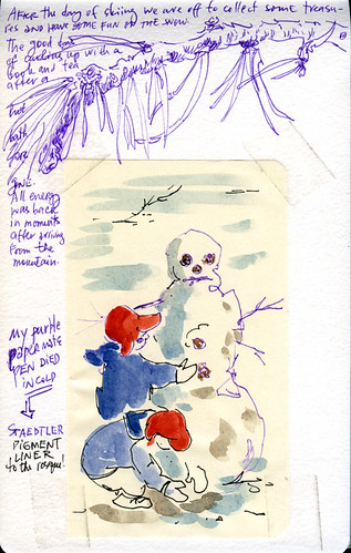
Left: Brush pen sketch (Pentel Pocket Brush Pen) on a prepainted background page (acrylics) with gouache for the figure details. Image ©Roz Stendahl. Click on the image to view an enlargement.

Often, when people see my journals they ask, "Why do you use gouache?" And I have a double reply: 1. many of the papers I work on are toned or prepainted and gouache is a perfect medium for those surfaces; and 2. it's fun.

Let's face it, the second reason is the driving force for my use of gouache. Sometimes I just can't go to bed at night until I paint a little with gouache because it's just so much fun, I just want to push the paint around.

You can go to my blog, Roz Wound Up, and click on the "gouache" category in the category list and find many posts on various aspects of gouache. Getting people to use gouache is one of my goals in life (just as getting people to make their own journals and getting people to actually keep visual journals are life goals for me).

But there's so much writing about gouache on my blog that I thought I'd give you a little primer on what I love about it—to try and get you hooked.

There's the fun factor of using gouache.

If you go to this link you'll actually see a close up of the image at the end of the post and then you can see all sorts of details, just as if you had your nose right in my journal. Go peek now. Doesn't that look like the most fun ever! Paint on paint. Sure you can do this stuff with oils, but there are all the smells. Acrylics, same thing—and the speedy drying time and danger of mess if you are out in public.

For me using Schmincke's gouache or M. Graham's gouache allows me to have all the fun of transparent watercolors (because they both wash out into lovely clear washes) and the fun of opaque passages where I can push the paint around if I'm so inclined.

Look for a moment at how you can use gouache with toned paper. If you go to "Sketching and Collage from the Page Up," and scroll down into the post you'll see the toned paper which has first been painted with acrylics, then the pen sketch, and of course the finished piece which has thick and light applications of gouache. I like to be able to do all of these things when I paint. Why limit myself! It is fun to use gouache in part because the possibilities are so wide open.

There's also the paint economy issue. If you put out a little too much paint one night unlike your acrylic paints, you can still use the paint the next day. I have an example of using up old paint coming up this Wednesday on my blog, but you can see a previous example in "Practice Before Bed." 

(Note: If you use Schmincke and M. Graham brands of gouache your ability to rewet paint that has dried on your palette is going to be very simple. That said, I often use cheaper and chalkier gouache brands in the studio and then use those dried paints the next day because I'm not looking for a fresh experience, but just some fun. If you want the most workability from your paints I recommend you stick with Schmincke or M. Graham brands of gouache.)

There is something to be said for making a perfect wash in watercolor, for making the stroke of transparent watercolor that totally tells the story you wish to convey. There are masters of watercolor who do that constantly. I love looking at their work.

Then there are those of use who tend to fuss.

Yep, I fuss. Though it is another of my lifetime goals to stop fussing and I get better every year—with a major setback now and then.

If you are someone who fusses then gouache is the paint for you!

One of my landscape painter heroes is Thomas Paquette. I was amazed to hear that he reworks and reworks his small gouache paintings. They look so fresh and wonderful. (His level of fussing can only be called finesse,  and become a level to which we can all aspire.)

So whether you fuss or finesse, gouache is a paint that again, lets you have it all.

There is also something about the texture of a finished painting that speaks to me, regardless of medium. And for gouache, the ability to have a blending of techniques and textures is just too appealing to forego.

The type of texture and detail you get will depend on the brand of paint you select and your working method. Chalky opaque brands (which I don't use in the field because they don't rewet well from the homemade pans with which I travel) give a hard edged and often jarring texture to things that I love, like the dog in "Details, Play, and Old Gouache."

With the two quality brands that I use, Schmincke (the link is to the online store I buy it at as it isn't available locally) and M. Graham (do a Google search to find local availability), I find that I get wonderful color blending and mixing and detail. They become my go-to paints for my detailed paintings of birds and rocks. You can see one of my gouache rocks here.

Fine strokes, blends, it's all possible with this paint.

Here's what you need to do. Pick a brand. I recommend either Schmincke or M. Graham for beginners in this medium— M. Graham if you are cost conscious. Neither of these brands has  opacifiers in their paint and your color mixing is going to be more satisfying and less frustrating. You'll loose a little smidge in the opacity department, but you'll be able to work around that with some paint handling skills.

(The other brands of paint tend to yield muddy mixes because of the opacifers and the use of more multi-pigment paints. Years ago I used Winsor and Newton gouache and found the pigments were fugitive and the paint chalky. I needed a paint I could fill pans with and with which I could travel. Recent ads for this product claim that they no longer have opacifiers in their paint so the quality maybe improved, but I would be sure you get the new stock that is improved; and I would also caution you to check up on the pigment quality used in each tube you want.)

Once you have your paints (you can go here to see my travel palettes  and you can go here to read about my limited palette for gouache) you need to get your brushes dirty and mix some paints and learn how the paint works. (If you are really cost conscious when getting into a new medium don't sweat it—get a red, yellow, and blue, and zinc white to start.)


(A note about brush selection: you can use any watercolor brush and most acrylic brushes for gouache with great success. I recommend that you select quality synthetic brushes to practice with rather than grind a pricey sable brush into the ground. I keep my transparent watercolor brushes separate from gouache brushes because I don't want to worry any transparent washes with the introduction of heavy—more coarsely ground—pigments inadvertently left in a brush. But that's me fussing again. You can read about the brushes I use and why at Roz Wound Up.)

I recommend that you begin with dilution tests. Put some paint out on your palette and with a clean brush drag a bit to an area and mix it to the consistency of thick cream and start brushing that around on your paper.

Oh, and do your exercises on watercolor paper you normally would work on or use Arches watercolor paper. Now is not the time to experiment with paper. I also recommend a cold press paper so that you have some texture, but not so much texture in the paper that you struggle with brush loading issues. Hot press paper is another great way to practice, but you don't immediately get to see all the fun textures that simply dragging a dry brush across paper will yield.

Watch how you load the brush. If you have to add more water to the brush it will make the paint too liquid, but at some point you have to do this so experiment with drawing off the excess water in your brush by touching the base of the brush, near the ferrule, with a paper towel and drawing that water out, leaving most of the pigment. Now do some more stroking.

After a couple hours of playing in this way with your paint you'll start to get an idea of how much paint to water you need for the type of stroke you want to make. It depends in part of the type of brush you're using and the brand of paint you're using.


Whether you're using rounds or filberts (one of my favorite brushes to use with gouache) will also make a difference in how the paint handles. With filberts you have a curved, flat edge that pulls the paint along. Quite a thrill.

Once you have a sense of how to make everything from a dry brush stroke (in which you simply touch your pile of squeezed out paint with a moist brush, i.e., one that was wet and squeezed dry), to wet washes as you would in watercolor you can start mixing your colors to see how they blend.

You'll want to try palette mixing as you do with watercolor, but the most fun will be to paint an area of color and let it dry (or nearly dry) and then paint another color next to it or on top of it and blend the two.

Again, this exercise will require that you learn how to control the water in your brush. I recommend that you work with a moist brush as described above—wet brush squeezed dry in your towel. Then add more water to the brush as needed until you get the blending desired.

One of the most fun things to do is put a second color over a layer of color and make dry-brush strokes of that second color. The broken color gives a great texture effect.

Equally fun is to work with a fresh, undiluted color picked up on a fairly dry brush, and blend that color into a wet or moist color passage already on your paper. YUM!

Do all of these things on a test sheet divided into squares. You'll find where your strengths lie, which approaches need more work, and also you'll discover which textures of this paint you cannot live without.

Why? because in doing these tests you'll get a sense of the paint on your brush and you'll be hooked.

You'll be staying up late into the night just so you can make swirls of thick paint seamlessly meld into other swirls of paint. Just feeling the push of the paint on the brush will make you fell purposeful!

Now that I've got you hooked and you have an opaque paint that is portable (in a way acrylic isn't really) and you're having all this fun, please take a moment to participate in Project 640 Tubes.

You guessed it, it's another of my life goals—the campaign for PB60 in the M. Graham line.
Roz Stendahl
Related Posts Plugin for WordPress, Blogger...