28 ARTISTS & JOURNALISTS
their work and words, interviews, blogs, images, hints, tips, websites
and more...

Monday, November 7, 2016

New Stonehenge Watercolor Paper!

I was recently asked to review the new Stonehenge watercolor paper from Legion Paper--they sent me samples*, and although I am VERY happy with it and plan to get more for my journaling projects as well as painting, you know I'll be honest...I've been devoted to Fabriano for years, and this had to measure up to some stiff competition!

It did.

So let's get right at it!  I had small sheets of 300 lb. rough, 140 lb cold press, and 140 lb. hot press to experiment with, and I really put it through its paces.  I threw about everything at it I could think of...

It's a good bright white paper, with both internal and external sizing, so it's pretty tough.  I'm not terribly hard on my paper, but I did use some of the rougher techniques I could think of.

This is the 300 lb. rough paper I tried first...

Salt and scraping...
 
I worked very wet in wet on the two examples above, and used spatter, spray, salt and scraping--it handled all of those well.  I hadn't stretched or taped the paper down to a board, so it did buckle slightly while wet, but it dried nicely--and since I usually DO tape down my paper when doing an actual painting rather than working in my journal, I don't consider that a problem.  (I didn't notice any buckling in the small journals I made...)


Here I did a variety of small test swatches on the 300 lb. paper..lifting at upper left (scrubbed pretty hard on that one with a Mr. Clean Magic Eraser and there was some slight pilling, but they brushed off when it was dry); drybrush in the middle that nicely shows paper texture; scraping at upper right with an overlay of soft color.

The graded wash at lower left would have been smoother, but that was MY fault, not the paper's!  Again some lifting, gentler this time and no pilling.  Finally at lower right, nice glazing of colors.

The other papers, both 140 lb. lent themselves to my favorite approach these days, journal making.  I did a meander/maze journal from the hot press,  and an accordion from the cold press, below.


This is the little accordion journal, with cold press paper...fun!
I packed up the accordion and headed out to Watkins Mill to explore its capabilities.  I love that pine tree and it made a terrific subject.

I started with an ink sketch of the trunk, then tried a variety of effects that the cold press paper handled just fine...wet in wet, drybrush, scraping, no problem.

You can see the nice paper texture here...
 
I painted the small branches with the pointed, sharpened end of my watercolor brush, below.


The finished sketch...

...and playing with approaches and textures on the right...

A graded wash, and drybrush with a flat brush at top and a round one at the bottom.  I enjoyed the texture, which you can see above in this photo taken on a sunny day!  Again a graded was was successful on the CP paper...


I love the way you can work across the fold in this type of book, and just keep going!

Though it IS watercolor paper, I decided to try other mediums as well...different graphite pencils, here...

...some watercolor pencil...


A bamboo brush and ink...

I made the brush from a garden stake...obviously not for detail work, but it seemed to love the paper texture too!

These are some of my favorite pigments...the colors really sing on this paper.
Going for broke here...drawing back into a wet wash with ink below, blotting, edges, spatter, granulating colors, salt and clear water...yep, the paper can take it!
So...was that all?  Nope, still had the hot press to test out, though that little meander journal still has some pages in it to play with...

The cover for the meander journal....

This is the meander journal in the process of making it--3 folds with the grain, three across.  I did notice that the paper's folds were more visible against the grain than with it, though nowhere near as badly as Arches, which tends to crack. 
I couldn't resist my favorite Prismacolor colored pencil for sketching, on the smooth paper...nice...

Of course it took ink and watercolor well...

Granulating paints really show up on this surface...loved that.  It's Daniel Smith's Lunar Black in wet washes...

I got a set of Gansai watercolors and tested them out on the HP paper as well...the colors are brilliant!

And finally many layers of gouache...the smooth, bright paper was perfect!

..as noted in this post, it will be commercially available in December--check with your favorite supplier--but you can get samples to play with right NOW by filling out the form you'll find here... Legion Paper's new Stonehenge in a variety of weights and surfaces: http://www.legionpaper.com/stonehenge-aqua

Try it out and let me know what you think! 

* I received no payment for this review other than the paper itself--full disclosure here! 

Thursday, November 3, 2016

New Watercolor Paper Samples for you to try!

This is the new watercolor paper I've been testing...it will be commercially available in December, but you can get samples to play with right NOW, Legion Paper's new Stonehenge in a variety of weights and surfaces: http://www.legionpaper.com/stonehenge-aqua


I made a couple of small journals to test it with and will be using more! Here's a teaser--I was testing watercolor pencils, ink, colored pencils and granulating colors...I've had a ball.

Plan a blog post to share my experiments soon...

Tuesday, September 27, 2016

playing with Sailor fude pen and water-soluble ink


Last week we went to a Houston greenhouse in search of tomato plants for a fall garden. Up till yesterday, it's been in the 90s here in central Texas and we had heard that there are two growing seasons here, before and after the big summer heat.

We found no tomatoes there . . . Apparently fall gardens are put out in August and they had sold out. But we were able to find some nearby at Home Depot. Bill also found this purple leafed perennial ground cover he wants for the planting box he built next to his woodshop's porch. We're trying a couple of these plants, along with some tiny pink lilies our friend Ron recently gave us, to see if either one likes the location. And whether the deer like them. Whichever wins gets to fill the bed.

I'm continuing to play with my inexpensive Sailor fude de Mannen pen with its water-soluble ink cartridge. When the cartridge is used up, I plan to fill it with a water-resistant ink using a syringe. I also used my muted granulating earth watercolors on the plant . . . then wished I hadn't. The leaves and flower should have been a bit brighter.

Sunday, September 25, 2016

a rehabbed vintage Prang box


Last year I took my vintage Prang box, refit with my own choice of tube watercolors in pans, to Mustang Island, camping with the family. With it being so exceptionally windy and the sandy beach so fine, my paint box was literally sand-blasted -- a real mess! Not sure what to do with it, I set it aside.

This month, I finally took the paint pans out, cleaning them as best as I could with damp paper towels; most of the paint was still good. Then I sanded the inside surfaces with the fine-grade sandpaper that came on my pencil-sharpening block. 

I taped off the black edges with masking tape to keep them black. The black finish was worn with age even before the beach trip.

After several thin layers of white enamel spray paint, the inside is clean and ready to go. Pans were set in place with a dab of rubber cement, leaving room for a blue-gray watercolor pencil and a #7 round sable travel brush.

My tweaked color choices:
permanent rose, pyrrole scarlet
quinacridone gold, Hansa yellow light
sap green
cerulean chromium blue, ultramarine blue
yellow ochre, burnt sienna, raw umber
mixed gray (ultramarine and burnt umber, stirred together)

and half pans of:
Indian red, perylene green, and buff titanium.

Wednesday, September 14, 2016

Stillman & Birn Epsilon sketchbook

I still have one more un-used hand-bound journal on my shelf, but this time I decided to use this Epsilon sketchbook from Stillman & Birn that a dear friend gave to me. The paper is made more for ink than watercolor, but light not-too-juicy washes work well on it. And my fountain pens simply glide over the smooth paper!
Every one of Stillman & Brin products are a dream to use, and the binding lasts no matter how rough I get with it.


As always, I drew my current sketching palette on the first page. Actually, this is the second 2-page spread -- I left the inside covers blank for collecting random quotes. Lately I have been carrying a larger purse than my norm, allowing me to carry a full-size sketchbook and this pocket art toolkit from Expeditionary Art inside the bag. Smaller bags only hold my tools and I carry the book separately. 

In the kit are two fountain pens (one with water-resistant ink and one with water-soluble ink), a waterbrush, two travel brushes (a #8 round and a dagger), a mechanical pencil and tiny case holding a kneaded eraser, a tiny stencil brush for spattering, a shortened white pencil, a shortened blue-gray watercolor pencil, a re-usable towel for wiping, and two pocket palettes, also from Expeditionary Art. I can switch out either of these palettes with a third one: one holds a basic warm/cool limited palette, one holds granulating earth colors, and one holds gouache. Not shown is a 4th set I made myself using a business card case that holds a basic palette of 14 paints.

Just after putting together my pocket palette set of granulating earth colors, Jane Blundell posted one she put together . . . so I had a bit of fun comparing our sets side-by-side. I have a set of Daniel Smith color dots that I used for the colors she uses that I don't own. She also recently put together a set for urban sketching along with some suggested options, so I added that just for fun.

Saturday, August 27, 2016

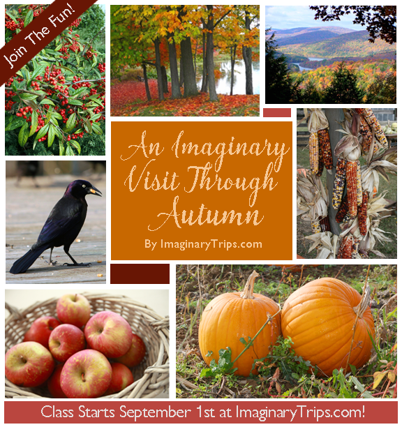
It's Time For A Visit To Autumn!

Okay, I'm in serious denial. This is Florida with temperatures in the high 90's, with hurricanes and tropical storms swirling around us, and we don't see Autumn before December (usually) at the earliest...but why let a little thing like reality spoil the party?!

 I'm going to have myself an An Imaginary Visit Through Autumn and my autumn is going to have cool temperatures, gorgeous jewel-toned leaves, a cup of tea, a bowl of my favorite soups, maybe even a wood fire! Wanna come play with me?!
I did this piece last November and it was meant to pay homage to some of my FAVORITE things! in fact, I was picking up acorns in a parking lot today. (I think I may have been a squirrel in a past life!) I'm thinking there might be a few more items to add to this list...

Farmer's Markets, gorgeous flowers, scarecrows, crows, acorns, pumpkins, and who knows what else might show up on our sketchbook pages! I hope you'll consider joining me. The class will be four assignments long (6 weeks) and starts this coming Thursday, September 1st! 

I can tell you it's going to be a blast. I may have to crank the AC down and dodge a hurricane or two, but I can't wait for cooler temperatures and turning leaves!

For more information on An Imaginary Visit Through Autumn, please click here. I look forward so sharing the fun with you!

Friday, August 5, 2016

Playing with Papers!

Sometime back I got a variety of papers from Legion Paper, and since I love bookbinding I put them all together under one cover and bound them into a Sampler Journal...check out their Sampler Department for a dizzying array of choices for all kinds of paper needs: http://www.legionpaper.com/samples/

It's quite a big book with multiple signatures...and I left the stickers on the papers so I would remember what I was using!


I'm only partway through this book...maybe 2/3--but I decided (since I'm expecting more papers to test!) that it was time to share my impressions thus far.

As usual, I am most interested in papers that would work well in a journal, with a variety of mediums: fountain pen as well as disposables, graphite pencil, colored pencil, watercolor pencil, and of course, watercolor.

I generally enjoy a cold-press or its equivalent, but sometimes hot press and a bit of rough as well.  I look for a pleasing surface that not only looks but FEELS good with these varied choices--I prefer a tough surface that will take some punishment, too.  It's a lot to expect from a paper, but some of these really stand out.  I'll be ordering more for my next bookbinding marathon!

Some of these papers are not meant for watercolor, but pleased me mightily by working just fine for that medium.  Loved them...

Other papers are lovely for the purpose for which they were intended, but for the way I work, not so much.  A soft surface drives me crazy with its tendency to drag both pens and pencil points, as well as absorbing watercolor too readily.  I think they're likely perfect for printmaking, but not for my needs.

So...here are my findings so far, in no particular order or ranking--they're just how the ended up bound into the book, sorry.

Saunders Waterford was quite nice with a variety of mediums...it's a watercolor paper, with a slightly soft surface but very nice with ink as well.

For some reason colors dried lighter on the Waterford than I put them down...that often happens with a paper with a lot of sizing, but this was more than I'm used to.

On the other hand, these brush tests worked beautifully on the Waterford.  I'd give it a big thumbs up and remember to mix my washes stronger.

I adore Drawing Bristol, I just do--always have.  For a variety of mediums.  WANT MORE.

I use Stonehenge a lot when I'm binding books, mostly because I love the Kraft paper tan (this isn't it though...it's darker and warmer.)  I was disappointed to find ink feathering more than I expected, so I'll be careful how I use it.

It's delightful with dry mediums. though!  Stonehenge stays in my arsenal.

Somerset Velvet--not for me.  Too soft, pens and colored pencils tend to drag on it. 

Arturo Cover on the other hand is wonderfully versatile!  LOTS of thumbs up, and I definitely want more.

I really didn't expect the Arturo Cover to work this well with juicy watercolor, but it performed like a champ.  Love!

More Somerset Velvet.  Nope.  Not for me.  Way too soft.

I had three weights of Multimedia Aquarelle and loved all three!  Great, bright, strong paper, handled pretty much any medium I threw at it, including a fine pen.

This is the lightweight 90 lb. Multimedia Aquarelle...I deliberately made a wet, juicy wash to see how much it would buckle.  Absolutely minimal!  The thinner, lighter paper would allow more pages and more signatures in a journal.  Thumbs up!

Yep, I'm in love...brush testing on this page, pleased with how true the colors remained, too.

MORE Multimedia Aquarelle.  Must.  Have.  Gorgeous stuff, and truly multi-media.

Folio, nope.  Probably as its name suggests, a printing paper.  It took pen okay but not all that exciting.

Folio is definitely NOT pleasing with watercolor, the wet pigment soaks in and looks gray.

Lanaquarelle, on the other hand--YUM.  Same colors on this paper as on the Folio were much more vivid.

Lovely with all these mediums, too.  Ordering more...

Ink wanted to feather on the Folio, especially if the pen writes rather wet/juicy.

Sorbet text is quite lightweight, and comes in rich color...fun for light washes, a dryish application of gouache, or colored pencil, though.

This is Arches Cover, not their watercolor paper, but--I wasn't thrilled with it for ink, either, it felt a bit soft.  (But then I don't like their watercolor paper...)  It DID work well with a different pen, and as always that makes a huge difference.


Again, ink wants to feather some on Coventry Rag...not high on my list.

So overall, for me...not Arches Cover, Coventry Rag, Folio, or Somerset Velvet, but the others have definite possibilities for my artist's-journal keeping self!  (As they say, YMMV.)

----------------------------------------

And this from Legion Paper's website...they're good folks and very helpful:


"It is our mission to continue to travel the world in search of the most intriguing and best performing papers - from delicate handmade papers that reveal striking texture and color with every sheet to the most technologically advanced digital printing papers produced today.

Following [on their page] are just some of the mills that we represent.  In addition to these, we have over 40 other mills all over the world with whom we work on a regular basis to have papers made to our, and our customers', specifications."

If any of these interest you as much as they did me, go to the Legion Paper link, above, and then to the specific paper you want to know more about.  On each paper's page there's a "where to buy" link in the bottom right hand corner!

Going there now...wheeee!
(And yes, this is on my personal blog as well...wanted to share with you, too!)
Related Posts Plugin for WordPress, Blogger...