28 ARTISTS & JOURNALISTS
their work and words, interviews, blogs, images, hints, tips, websites
and more...

Showing posts with label art journals. Show all posts

Thursday, March 21, 2019

Come Join The Fun On An Imaginary Trip To SW France!

I've always heard about the gorgeous light in Paris, but I never imagined that all of France (well, the parts I visited anyway) would have that same light! At times, it seemed pearlescent or iridescent...and so very clear.

It was a delight to walk around medieval towns and villages to sketch and paint (and take photos) because of that light. But I would be remiss if I didn't also mention the subject matter of said sketches and photos...delightful visits to so many small towns, parks, rivers, castles, gardens, and cities made this trip worthy of being made into an ImaginaryTrips.com' online class!

I hope you'll join me for the Imaginary Trip To Southwest France and Le Vieux Couvent! We'll explore the lovely convent and its gardens, where we stayed as well as some of the most intriguing small villages (Saint Cirq Lapopie and Beynec), larger cities (Sarlat) and some off the beaten path destinations (Castelfranc).

There is something for everyone! I will be sharing my sketchbook and the pages I created while in France and I'll also show how I create a more finished look to those pages once I'm home.

Class starts on April 18th and will feature four assignments. There is an interactive class as well as self-study class option available.

To join in and get registered today, please click here for more information!

____________________


I am going back to LVC in September this year and would love to have you join me for the 10-day travel and art workshop! It's not to be missed! The convent was originally built in the 1600's and has been lovingly refurbished into an art retreat complete with secret gardens, a koi pond and lovely courtyard. The classroom and art library are both huge and available 24/7.

This is a true immersion experience as we will get out to explore, sketch and paint the Dordogne and Lot Regions each day! We'll make use of the classroom to finish our pages in the evenings and during any inclement weather.

And I have to say, the people of LVC make this place truly magical! From the wonderful meals they create from local sources to the care they show in everything they do, this is one of those rare workshop opportunities that transcends the words, "travel art workshop!"

I hope you can join me for this awesome experience!

To learn more and get registered, please click here!

I hope to see you in France!

Tuesday, May 16, 2017

Sketchbook Review: Field Artist 4" Square Watercolor Journal

Click to enlarge
Every once in a while, I spot a new art toy that I just know is going to recharge my flagging art energies and it happened when I saw the Field Artist 4" Square Watercolor Art Journal!

I just knew I was going to love it because:

  • It's small. At only four inches, it fits in the palm of my hand when closed. 
  • It's square. I've been having a love affair with squares for many long years and I am almost always captivated by something squared, especially if it is not usually found in that shape!
  • It's a watercolor journal and that always makes me happy. 
Upon receiving the art journal from Amazon (no affiliate links), I immediately pulled out my stamps and embossing powder and decorated the front cover. The journal does have an elastic band to keep it closed that cannot be seen in the image. 

While I adore the effect, I don't recommend doing this as the embossing is not holding up well. My journals are well traveled. They go everywhere I do and that means they typically tumble around in whatever bag I am carrying. The cover itself is a "PU leather-like fabric" and is holding up just fine. It's the embossing I added that is not. 

My first piece of art is on the inside of the cover. The paper used as the endpaper is not the same as the journal pages. It's much lighter in weight so I opted to use markers to create my design. The paper didn't hold up well even under marker so I caution you about using any kind of wet media on it.  

The endpaper on the inside right sports the sketchbook branding and is oriented so that the logo only reads correctly when the book is opened top to bottom with the fold of the journal above the logo. You can also see the yellow ribbon page marker in the image below. 

I'm thinking I'm going to be gluing an additional piece of watercolor paper over the branding page and using the space as a place to put my "if lost, please return" info:

Eventually, I worked my way to my first page. Since the book is small and I knew I wanted it to record "everyday adventures" that seemed to fit as the title page as well as the theme. I think we often have far many more adventures than we realize. It takes paying attention to notice them though. 

Those adventures can be as simple as having to take a detour due to construction and seeing something new or it may be notice a pretty bloom on your way to the mail box (even if it's a weed!). 

By elevating the ordinary by paying attention, we can make it extraordinary!

The page has ink from a Faber-Castell Artist PITT Pen as well as watercolors on it. There was no bleed through from the pen or paint. The pen performed very well on the paper with no skipping or bulking. 

There is a slight textural difference between the two sides of the pages and they don't always match up. Sometimes you have two different textures across a spread. There doesn't seem to be a pattern to where the difference will show and where it will not. It's slight enough that it can be ignored even if it is visible. 

I found the time to capture a family of wrens that have been visiting our backyard in the evenings. The babies had just fledged and were a little clumsy the first time we spotted them. Four days later and the only way to tell the parents from the babies was the fact that the babies were still following mom and dad around with their mouths open waiting to be fed!

There is a stamp in the upper corner that did not bleed through to the other side even when I painted over the stamped area. Again, pen and watercolor were used in the piece.

One last little surprise was the long accordion-fold, panorama page that is attached in the very back of the book in place of a pocket. It is four panels wide, but the fourth panel is partially glued to the back cover giving you only three panels to be painted on the back. I have to admit a pocket at less than four inches in width probably wouldn't have been very useful! 

The paper is marketed under the Chinese brand, Image. I was not able to find further information on the maker or the paper. 

So here are my pros on this adorable little journal:
  • It's small and very portable. 
  • The size is perfect for capturing a quick sketch. 
  • The paper is acid-free and dries flat without having to be weighted or dried with a blow dryer. 
  • The paper has hard sizing which makes it very forgiving when you want to pick up paint to get back to the white of the paper. 
  • It lies flat making it easy to work across the spread. 

My cons:
  • The sketchbook is very small and it takes some adjusting to getting used to working in it. It's hard to rest the heel of your hand on the page and draw at the same time! It is not difficult to adjust to the size challenges, but I'm thinking folks with big hands would really be challenged. 
  • The paper is not archival. Chances are good it is made from wood pulp instead of cotton or linen and they have removed the acids. However, this is not a deal breaker for me as I'm using this to play in rather than creating works I expect to wind up in a museum!
  • The paper has a hard sizing which makes it way too easy to lift color unexpectedly and it seems to take a bit longer to dry than other papers. While I put this down as a con because speed is important to working on location, it's not a huge problem. It just means I need to alter my approach a bit to fit with the paper of the journal.  
  • The fact that the paper textures do not match up across the pages. It's a minor thing to fix and because it wasn't, it speaks to rather shoddy workmanship or a lack of pride in their journals, especially given the last point... 
  • For the size, I find it a bit pricey at $12.95 (I guess we're paying for that extra dose of cuteness!).
So far, I've been very pleased with the journal and I've thoroughly enjoyed using it! I look forward to finding more little everyday adventures to record on its pages!

What new art toys have you found lately?

Wednesday, May 28, 2014

Reposting this longish essay about the uses of an artist's journal.


Hello everyone,


Back three years ago when I posted this, there were many fewer people following this blog. Since the question comes up again and again, I thought I'd repost this. It's still my answer to the question about the uses of an artist's journal. My uses. My journal. Maybe yours, too?
Back then I mischaracterized/misunderstood Kate's journals... they ARE pretty and they do have lots of finished sketches, but, as she has often pointed out since then, they are way more than pretty and often NOT polished and arty. ;D.

I hope this is helpful. I could TRY to say this all again in a different way, but I decided not to ;D.


Wednesday, March 23, 2011

My big fat black journal

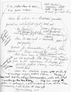
I’ve long been a fan of the kind of beautiful illustrated journal that Kate Johnson and others, like Roz Stendahl, Pam Johnson Brickell, and Danny Gregory, to give a few examples, produce.

Theirs are visually arresting books---almost art objects in themselves. They feature well-designed pages and handsome lettering. Often the books themselves are handmade, the paper of good quality.

While there may be entries of a personal nature, they are not so private that no thought is given to the appearance of the page for possible public sharing, even if the sharing is of a limited nature. In general, text and image are both important. The pages themselves may not be pristine. In Roz’s, Kate’s and Danny’s books, there’s lots of experimentation going on and many quick, quick sketches, but the overall effect seems to be of a well-made, nicely designed artifact. (I say ‘seems,’ because I have only seen these journals on line.)

My own illustrated journals, until recently, were different from these. They were more sketchbook than conventional journal, without a strong textual presence.

In those pages, I’ve practiced drawing because I LOVE it and so that I could become better at it. I’ve taught myself how to use watercolor, and, in more conventional journal-writing fashion, I’ve tried to get down on paper, in images, the important events and people in my life.

From the time I was about 8, though, I’ve written in diaries and journals. My sketchbooks were a thing apart from those written records of my life. For the past 6 years, my concentration on drawing and producing my blog Laurelinesput an end to my journal keeping.

A few months ago, I turned to writing in a journal again. In taking up journaling once more, I remembered the lessons I learned years ago from the powerful, transformative book, The New Diary by Tristine Rainer. Rainer advocates journaling as a means to communicate with oneself, to develop creativity, to solve problems, to enrich the inner life.

Emphasis is on freedom of expression, expanding consciousness, finding a state of flow ---and getting all of this down on paper any way you can. Well-designed pages? Good paper? Nice lettering? Well, unless you operate that way instinctively, intuitively, with your eyes closed, without censors or brakes... no.

When I restarted my journaling life, I had not planned to include imagery. Or not planned NOT to.
I just bought a big blank book (big enough to allow me to scrawl across a page) with mediocre paper (something that the sketching me would not have been happy about) and started writing.

And images appeared, there, along with the words!

Not as illustrations, but more the rough lineaments of daydreams or nightmares, the quick capturing of something my eye fell on as I paused in my writing, time outs from hard thinking, notes for paintings and projects, sometimes plain old documentation, too. The images are more fleshed out than doodles, yet only rarely are they anything close to polished art pieces!


The more the images appeared, the more I gave way to their flow. Now, I can hardly wait to see what will happen next!
Why I don’t KNOW what will happen next is because this new journal of mine is about process and not product. It’s about communication with the self, not with others.
And it’s about pulling together the various aspects of myself---myself the artist, myself the writer, myself the mother, wife, friend and all the rest... all in one place, between two covers of a regular old, big, black, blank book.

It’s an illustrated journal, but it doesn’t look like Kate’s, or Roz’s, or Danny’s, or Pat’s. It’s rough-hewn, private, with buckled and splattered pages, loaded with crossed-out words and wiggly arrows. It works for me. I write about it here as a way to show there are many ways to make this thing we call an illustrated journal and to say that maybe something LIKE this may work for you, too.


Tuesday, November 20, 2012

a new beginning

a new beginning by vickylw
a new beginning, a photo by vickylw on Flickr.
I've started a new sketchbook, with cleaned up palette and re-filled watercolor pans . . .

This handbound journal contains mostly Fabriano Artistico 140# hot press paper, plus a sample of Canson Dual 140# (cold press on one side, rough on the other). In the binding process, I forgot to add end papers . . . and found that I actually prefer it this way, using the same watercolor paper for end paper as well.

Though I'm no longer limiting myself to 3 primaries + 2 neutrals, I have larger pans of them in this palette. But I dropped Payne's Grey, switching to Monte Amiata Natural Sienna as my second neutral --- mixed grays and blacks are so much more interesting.

Sunday, October 14, 2012

Ups and Downs

The gift of a soft, rainy day, and the gift of a new journal...life IS good.

But not without its challenges...

One of the most important things about my journal is that it's a place to record the days--which was part of what the root word meant--the daily-ness of it.  We remember more fully, we deal with adversity, we celebrate, we find a sense of humor when we need it.  We play.  We express gratitude.  We explore.

I can't imagine doing without this...

Tuesday, March 13, 2012

My big fat black journal 3

It's almost a year since my first post about my big fat black journal. A year later, and five books filled,

I'm more than ever grateful for this way of becoming and knowing who I am.


I continue to use my journal to document my ideas, my art process, and my doubts and dreams.


(I'm still messy.)


(I'm still about process, not product.)

I'm still using my adored Stillman and Birn Alpha series 8 1/2" x 11" hardbound sketchbook, one every three months.

I still use pen and wash to respond to something beautiful before my very eyes.

If you need me, follow the trail of paint splatters and ink smudges. You'll find me, still here.

Saturday, September 10, 2011

where the fun begins . . .

where the fun begins . . . by vickylw
where the fun begins . . ., a photo by vickylw on Flickr.
Finally finished binding some new art journals this week. I've actually felt a bit "lost" not having one to grab and sketch in.

The two upper ones are Coptic stitched, both having a heavier 140 # watercolor paper in them which holds up well with this open binding.

The lower left one contains nideggen paper, a print paper I've always wanted to try. Because it is so much thinner, I also added some pages of Fabriano Tiziano toned paper --- scraps of both were used to bind the mini journal.

The landscape oriented journal is Fabriano 90 # soft press --- a paper I love but it's grain runs opposite, so I bind it in this format to get the most pages out of a sheet of paper.

I found some cardstock stickers at Hobby Lobby to stick to the fronts, making it easy to tell front from back. But some actually covers goofs --- The cover paper was from a Daniel Smith sale and was a bit thin, showing glue spots in places. The upper part of the tan bookcloth stained as well, perhaps from the green paper's dye running. Maybe it gives the book character??

Monday, July 25, 2011

New hand-bound journals!


This is what has kept me busy much of this past week...I was down to the last 5 pages of the current journal, and it was crunch time!  So J. tore paper for me last week, and folded signatures, I sewed and glued them, and over the weekend did the covers for all seven.

I am ready to ROLL.


It's fun making your own cover paper...my favorite, at right, is the inside of an old Strathmore watercolor pad, which had an interesting ridgy texture!  Originally I was just testing a Japanese Sumi-e brush, but it was so much fun...journal paper!  That's an old & stamp from an early 20th C. stamp set, but since I ended up with the paper upside down, it looks like a very strange lower case B!

Had to do the maroon cover too, with the brush, the stamp, and splatters and sprays...

The bottom journal was what's left of an old grocery sack I wadded up, dampened, and inked...it and my favorite on the right both have my handmade bookcloth for the hinges/spines, too...

Tuesday, May 24, 2011

New Artist's Journal Workshop Facebook group

We have a new Facebook group


At this point, the blog here has 28 co-authors, all people who have been involved in the book.  I love sharing here, and will obviously keep doing just that, with my own thoughts on journaling, product reviews,  interviews from our co-authors and their posts on process, supplies, tools, thoughts, needs, just as we've been doing for months now.  The FB group doesn't replace the blog...this place is my baby, not to mention a great place to meet with friends!

But I also wanted to create a place where we could ALL share our work--blog authors, readers, and anyone who keeps an art journal, so the Facebook group may just be the place.  You're welcome to join and post whatever you're doing in your own artists' journal!  I just set it up this morning, so join us and add your bits, you'll enrich it no end...

Don't be shy!  Finished work, quick sketches, whatever you're doing at the time...it's all about sharing.
It's an open group...so whether you do ink sketches, watercolor, collage, memory pages, travel journaling, , add your images! 

If you lose the link above, I kept it simple--it's got the same name as the blog (and the book!)--Artist's Journal Workshop.  Just enter that in the search box at the top of a Facebook page and it should pop right up.

I'm just learning the ins and outs of FB's updated groups, so be patient with me please...but feel free to go check it out, join us, add your own images, whatever!

And it will be fun!

Monday, January 17, 2011

Journal exhibition--wonderful work!

Gwen Diehn just posted images from a fantastic show she juried recently at Asheville BookWorks in Asheville, NC on her new blog--you won't want to miss these!

Find them here:
http://real-life-journals.blogspot.com/p/real-life-journals-exhibition-at.html

You'll be sure to recognize some of the artists...the very first one up is one of my favorite nature journalers, Andie Thrams, who teaches at various sites and offers a beautiful calendar ever year. (Click the calendar link to see the 2011 one on Etsy, all painted on the spot.

Your new blog ROCKS, Gwen!
Related Posts Plugin for WordPress, Blogger...