their work and words, interviews, blogs, images, hints, tips, websites
and more...
Wednesday, September 14, 2016
Stillman & Birn Epsilon sketchbook
Every one of Stillman & Brin products are a dream to use, and the binding lasts no matter how rough I get with it.
As always, I drew my current sketching palette on the first page. Actually, this is the second 2-page spread -- I left the inside covers blank for collecting random quotes. Lately I have been carrying a larger purse than my norm, allowing me to carry a full-size sketchbook and this pocket art toolkit from Expeditionary Art inside the bag. Smaller bags only hold my tools and I carry the book separately.
In the kit are two fountain pens (one with water-resistant ink and one with water-soluble ink), a waterbrush, two travel brushes (a #8 round and a dagger), a mechanical pencil and tiny case holding a kneaded eraser, a tiny stencil brush for spattering, a shortened white pencil, a shortened blue-gray watercolor pencil, a re-usable towel for wiping, and two pocket palettes, also from Expeditionary Art. I can switch out either of these palettes with a third one: one holds a basic warm/cool limited palette, one holds granulating earth colors, and one holds gouache. Not shown is a 4th set I made myself using a business card case that holds a basic palette of 14 paints.
Just after putting together my pocket palette set of granulating earth colors, Jane Blundell posted one she put together . . . so I had a bit of fun comparing our sets side-by-side. I have a set of Daniel Smith color dots that I used for the colors she uses that I don't own. She also recently put together a set for urban sketching along with some suggested options, so I added that just for fun.
Sunday, December 20, 2015
Sketching with Bent Nib Calligraphy Pens
 |
| Sketching our friends in the Copper Creek Band, with a bit of gray wash added... |
 |
| Molly Hammer and Joe Cartwright at Chaz on the Plaza... |
 |
| See all the line widths that are possible with just one pen? |
 |
| I added a wee bit of color today...this is my new softcover Stillman & Birn Beta sketchbook, LOVE it. |
 | |
| Quick sketches of details... |
 | ||
| Showing this again to show how the nib can be held to get different effects. |
 |
| "Urban Removal" works... |
 |
| Fun for nature subjects too... |
I've got several Hero and Sailor calligraphy pens, almost like drawing with a brush. The pens are generally quite inexpensive...give them a try!
Tuesday, February 4, 2014
Escapism via The Artist Journal
 |
| The Heart-Held Cottage Watercolor and Ink Stillman and Birn Bound Beta Sketchbook 5.5 x 8.5 inches |
While I'm definitely not an architect and I certainly wasn't become overly concerned with the laws of physics in my house plans, I did have a great deal of fun thinking about the rooms I would have and the type of furnishings I would surround myself with. The colors and material choices were all up to me without considering someone else's tastes or needs (unless I chose to include them).
The pages developed over the two weeks I was sick and I worked a little bit here and there until they were finished.
But in a way, they'll never be finished as I have enjoyed the escape so much, I'm already planning my next getaway!
The things I learned for next time:
- I'll work bigger and create the floor plans to take up an entire page each.
- By working larger, I'll be able to add in more detail when it comes to the furnishings, window treatments and such.
- I will work on both the views of the inside as well as the views looking out the windows.
- I'll focus more thought on where the getaway is located‚ like the beach, mountains, underground, or in a pasture or forest.
How about you? Care to join me in creating a fabulous getaway that only exists in your imagination and on the pages of your sketchbook?
If you do, please comment back here so we can come and visit your secret hideaway!
Sunday, January 20, 2013
Letting the journal lead US...
...because really, I've found that the format, style, and even the kind of paper make a huge difference in how I use my journals--at least some of them, and to a certain extent.
I'm playing with lighter, smoother paper in the journal above--Strathmore's multi-media paper I recently bound into a book. It's lighter and smoother than my normal hand-bound journal papers, so not quite as much juicy watercolor work (it does buckle slightly), and more writing--because it's a pleasure to write on! The pen glides...
I've found the same thing with my Stillman & Birn Epsilon journals, with very smooth paper--in fact that one has become my must-have daily writing journal, where I might do several pages of written meditations or observations, THEN add a sketch, either related or not. (I'm looking forward to the upcoming Zeta journal, which will have heavier paper but still this gorgeously smooth stuff!)
 |
| This robin caught my eye as I was journaling...so he ended up in my lovely Epsilon journal. The pen skates lightly over the paper, and the watercolor goes on crisp and puddly. |
 |
| I often add toned paper to my handmade journals...so of course I'm moved to add gouache or utilize light and dark colored pencils or inks... |
 |
| This was a quick sketch with ink and colored pencil in the hardbound Strathmore journal. |
.JPG) |
Of course many people work only on loose sheets, in an online journal, or even with an app so their work is only on paper if they print it out...
SO--how do YOU feel about paper and format? Does a ringbound book feel more ephemeral? Or is it just me...
Thursday, October 25, 2012
The Self Imposed Ink and Exercise Challenge
This is my first entry and I've got to say writing on this paper with a Micron pen is dreamy. The greys were created with grey and black Pentel Sign Pens that I hit the tip of with a waterbrush, then added the ink to the page. The water/ink combo spread like butter.
One thing I really like about using a waterbrush is that it dispenses just enough water to get the job done. This is very useful when the paper being used is not necessarily meant for washes.
This journal has two purposes. The first being to get me off of my desk chair and moving about. That's a challenge in itself as I get lost in my work and time goes sailing by. The second, and most fun, is to explore ink.
I'm glad the journal has many pages as there are so many inks waiting to be tried :) Which leads me to the back of my journal where I create color test pages......
 |
| click to enlarge |
Tuesday, March 13, 2012
My big fat black journal 3
I'm more than ever grateful for this way of becoming and knowing who I am.
I continue to use my journal to document my ideas, my art process, and my doubts and dreams.
I'm still using my adored Stillman and Birn Alpha series 8 1/2" x 11" hardbound sketchbook, one every three months.
I still use pen and wash to respond to something beautiful before my very eyes.
If you need me, follow the trail of paint splatters and ink smudges. You'll find me, still here.
Friday, October 14, 2011
Experiencing Stillman and Birn Alpha Series Sketchbook
Cover withstood some vigorous activities, was subjected to kids running over it (by accident), heavy and not so heavy rain, kitchen table and sandbox adventures, sticker attack, not to mention normal wear and tear and now that I am about to deposit it on the shelve - it looks great - not a scratch.
Paper worked very well with dry - and water media - I worked with watercolors, acrylics, multiple inks and gouache and in all cases buckling was well within expected amount for this weight of the paper (100 lb). I used markers, all kinds of pens, some collage as well. Paper was reasonably responsive to lifting and multiple applications though in some cases uneven in the way pigment settled in: I would do a single brushstroke wash, try to lift something and see that part of the edge is still editable where another part is not. It adds some personality to the page and can be incorporated nicely - you just need to be ready sometimes.
My problems were surprising: waterproof inks (and permanent watercolors for that matter) were not exactly waterproof unless I waited for ink to settle for a long time. And during first 1-1.5 minutes even the most waterproof and smudge-proof ink was smudging badly. It happened with Uniball pens, Pentel Pocket Brush pen, dip pen with Noodlers ink, pitt pens and brush-pens - the only pen that was working without a glitch was the cheap ballpoint I love so much :) So - some smudging and some not-so-waterproof adjustment was needed - and for someone drawing quickly it took me some time - but I had a lot of fun in the process:
(these are obviously not all 124 pages I filled - lots of private notes and experiments took place there - but you still can see some results ;)
Tuesday, August 30, 2011
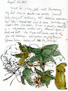
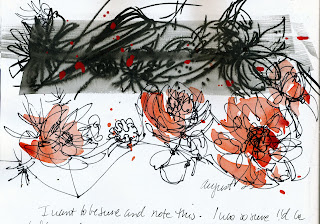
My big fat black journal, revisited

Back in March, I posted about my way of keeping an illustrated journal... big, messy, and personal. Now, I'm here with a tale of even messier and more precious (to me) pages! From January to April, I used a large, cheap, black hardbound blank book and loved the fact that it was so NOT special. I could, and did, let go completely in that book. Still, the painter in me longed for sturdier pages and so I took up a Stillman and Birn Alpha Series book and there was no going back. They are expensive, but for someone like me who paints with acrylics in my journal and make lots of layers, they're worth it. My illustrated journal has become my portable art lab and, I guess, my life lab, too. Here are a few of the uses I've put my journal to recently.


I'm on my third journal of the year. I figured I'd go through one a quarter, though I'm almost at the end of my current one, and September's looming! I look back over what I've written, painted, and drawn this year.I see changes in my narrative, my line work, my imagery, my focus, my energy... and it's exhilarating! Not only is this trajectory documented in my journal, it exists largely BECAUSE of my journal! We know who we are by reading what we've written, by looking at the images we've created. In these pages, I see my own signposts and I follow them.


