.jpg) |
| A new brand, for me--well relatively, anyway. |
Liz wrote recently about trying new materials and approaches; Alissa is pushing herself to discover more about travel sketching. Laura travels to some amazing places to sketch, and has also challenged herself by painting a single subject (trees, faces) or using one color as dominant for a month, in the past--I think we learned almost as much as she did.
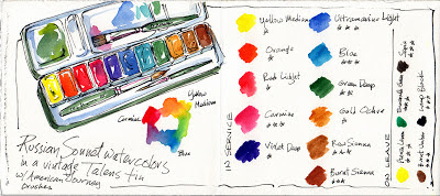
Right now, I'm exploring watercolor. Again. Still. Different brands, like the Russian Sonnet watercolors above...I found them on eBay and put some of the little pans into an old metal Talens paint box. (They're a less expensive version of Yarka St. Petersburg/White Nights watercolors, but so far they've passed all my tests with flying colors. Literally! )
I've used Winsor & Newton for decades, and over the years I've also tried Daniel Smith, Schmincke, Maimeri Blu, Kremer and others...but people kept raving about the Russian paints, doing such gorgeous work (like Pat Southern-Pearce!) that I just had to explore with them.
I'm doing a long-range fade test on them, which I'll report on later, but so far--yep, these are gorgeous, lift well, and mix beautifully, and I can't detect any fading over the months they've been exposed.
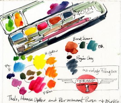 |
| Going simpler...with room for brushes, drawing sticks and lots of mixing area. |
And in my ongoing attempt to simplify my life and lighten my load, I've set up one of my vintage Prang boxes with the primaries with two convenience colors--Burnt Sienna and Payne's Gray. (On the left, here, you can see color tests with the Sonnet paints, and on the right my "new" old primary box.
Funny, when I first started painting with watercolors, Prang used to make a box that was just the primaries and black. I LOVED it. That's all I'd use, for years...I feel like I've come full circle!
I found out when I made my first little home made Altoids box a few years ago that I didn't need a billion colors--I just stumbled onto this combination, and recently I've been reading many resources that explain why they work! If you choose Phthalo Blue or similar, cool, clean Quinacridone Red or Rose (or Permanent Rose) as your red, and a good clear yellow, you can mix about anything--as you can see above. I started out my painting career with a warm red and a cool one, a warm blue and a cool one...but if I add a touch of rose to my Phthalo, I get something very like Ultramarine Blue. A little yellow in that nice clean rose gives me a good orange. Nifty!
Sure it takes a moment more to mix (hence my two convenience colors!)...but I'm balancing weight and simplicy against convenience and liking how it's coming out!
 |
| You can tell how light THIS kit would be. I took the lid off a second box to double my mixing area--it friction-fits on the bottom of the box. |
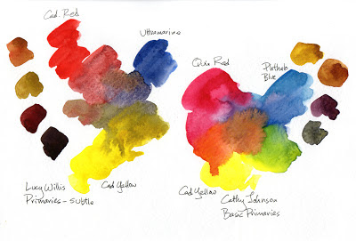 | |
| Here are some of my explorations...and how I got where I am now. |
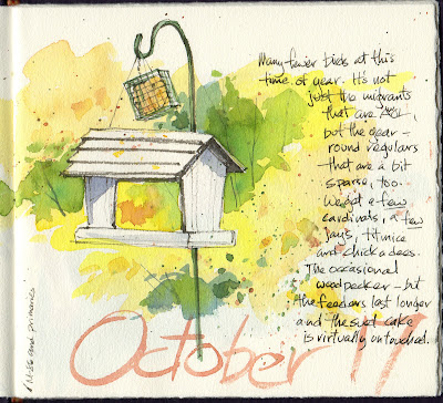 |
| Here's today's play...sorry the scan's a bit gray, the art definitely isn't! |

Thank you for a great education! I thought I needed every color out there......duh me.
ReplyDeleteI do like your primaries, vibrant and sparkling.
Please, did you get pans or tubes of those Russian paints? I've been eyeballing them on ebay for a looong time.
See? I still need more paint, ha ha ha. I'll wait till you've posted your fade-test results, tho'.
I got pans...I do see you can get tubes and I'll refill with them when I do.
DeleteI need to get back over where I've had them in a south-facing window for months, then I can post results!
I love playing like that! You are one talented lady - who gives so much - you and your family are in my prayers always & I thank you for all I've learned from you
ReplyDeleteThank you so much, Kathleen, prayers are ALWAYS welcome.
DeleteThank you so much for this inspiring and helpful post! I will try using just those colors and see what I come up with. I'm also always trying to lighten what I take with me, and next week I'll be traveling in Maine, so a good time to test it out.
ReplyDeleteI've pretty much used Winsor Newton as well and stumbled on Schmincke this spring and I'm about out of my favorite mauve, maybe I'll look into this brand. they look bright and transparent. I'm interested in you fade test too. It is fun to try new things. I went plein air this early morning and loved it.
ReplyDeletepeace n abundance,
CheyAnne
Kate, your blog posts are always so helpful! I used to avoid Thalo blue because it was so strong and is so staining, but now I like it because it is so strong and bright and makes such a wonderful black and greens. Now I know how to make it more Ultramarine! Funny how we consider colors and "make friends" with them, isn't it?
ReplyDeletehi all check out this brand from india http://www.mtcherian.com/art/watercolourbrands.htm
ReplyDeleteSuzie, it is indeed funny! We explore new ways to use things and it's exciting. CheyAnne, let me know what you think of Schmincke. I've got a friend who adores it, but I'm not that good with it. It feels almost TOO intense, for me. Melissa, let us know how it goes! And thanks, Cherian, I'd never tried that brand.
ReplyDeleteKate, maybe you should post the primary set as a challenge, similar to Brenda's 75-day ink challenge. I know I am going to give it more of a try than I have in the past. Last night, after reading this, I set up a 3 primaries plus 2 neutrals in a white plastic first aid travel kit. Color is addictive, and this is good discipline!
ReplyDeleteHey, good for you, Miss Vicky! You know I'm not one for formal challenges, but I WOULD like to see more people try this and share what they do!
DeleteThanks so much for sharing your ideas and new discoveries! I, too have been trying out every new color, brand, etc., but I wish I could just simplify and lighten my load. Not have it be so complicated! Maybe I'll challenge myself too to just paint with these five colors for a month to see what happens!
ReplyDeleteYou know what the old Nike ads used to say--just DO it!<:-)
DeleteThanks! You mentioned that you've been reading recent resources explaining why these color combinations work so well, could you share them with me?
ReplyDeleteCathy, I'm embarrassed to admit I can't remember where it was! I've read it in several places, but the recent one escapes me. (Getting old is tricky!)
Deletewhat a great looking blog! I've added to my blog list and will come back to have a proper browse later (dinner's burning!! so got to go now>>>>>>>>>)
ReplyDeleteThanks, Sharon, any time!
DeleteThanks Kate, since I turned 60 I'm wondering where my memory has gone! LOL! I'm definitely going to do this challenge for a month. I look forward to learning how to simplify and how to get the color I'm looking for........
ReplyDeleteI always love when you put little kits together. This one looks like what I need to do. I am starting to hike again and need to have everything light weight. I love all the challenges you mentioned too. So much fun so little time. Thanks Kate. I ordered one of your Ebay journals last week and now will use it for one of these challenges.
ReplyDeleteMy husband gave me long longed-for drawing lessons for an early retirement present. Then my long retired and widower father got in the act. We BOTH discovered your work at the same time - we are HOOKED! Thanks for your encouragement, welcoming manner and inclusive party atmosphere. We are no threat to Pablo or Monet, but we're having a blast sharing back and forth through the miles (he spends 8 months in the SW). You are an American treasure!
ReplyDeleteThanks all, and have fun! Angel, you are too kinds! And that's cool that you're hooked, what a fun thing to share with your dad. Sharon, I hope you like the little journal!
ReplyDeleteYou mentioned you were doing a long-range fade test for this particular brand. How did it turn out?
ReplyDelete